
19 Conversion Rate Optimization Examples and Proven CRO Success Across Verticals
 Reading time: 14 min
CRO examples show how targeted changes to a website or app can improve conversion rates, generate more qualified leads, and increase revenue. These changes can range from simplifying checkout or improving product page content to redesigning SaaS sign-up flows and mobile subscription experiences.
At Conversion Rate Store (CRS), we've helped businesses across eCommerce, Shopify, B2B and B2C SaaS, lead generation, digital platforms, and mobile apps identify conversion barriers and test solutions based on user research and behavioral data.
Our CRO success stories include a 29% increase in purchase conversions for Mariemur, a 56% improvement in booking-page conversions for GrantMe, a 173% increase in content-to-paid subscriptions for DoYogaWithMe, and a 30% increase in average revenue per user for Kabanchik.
Below, we share 19 real-world conversion rate optimization examples, covering what wasn't working, what Conversion Rate Store changed, the measurable results, and lessons businesses can apply to their own conversion optimization strategies.
CRO Examples at a Glance: Results Across Verticals
| Vertical | What Conversion Rate Store Optimized | Proven Results |
|---|---|---|
| Lead Generation & Service Discovery | Booking flows, insurance quote forms, sticky CTAs, provider discovery | +56% booking CVR (GrantMe), +17% search progression CVR (Preply) |
| Shopify & DTC eCommerce | Cart and checkout reassurance, return policies, PDP content, mobile customization | +29% purchase CVR (Mariemur), +23% CVR (NATPAT) |
| eCommerce & Product Discovery | Product selection, homepage UX, recommendations, cart abandonment recovery | +12% purchase CVR (PaintScratch), +23% mobile CVR (SomniFix) |
| B2B SaaS | Landing page messaging, product previews, sign-up funnels | +17.5% lead CVR (Comodo), +81% sign-up CVR (Localizer) |
| B2C SaaS & Digital Products | Premium upgrades, free trials, trust signals, registration | +173% content-to-paid CVR (DoYogaWithMe), +86% visitor-to-paid CVR (Cooksmarts) |
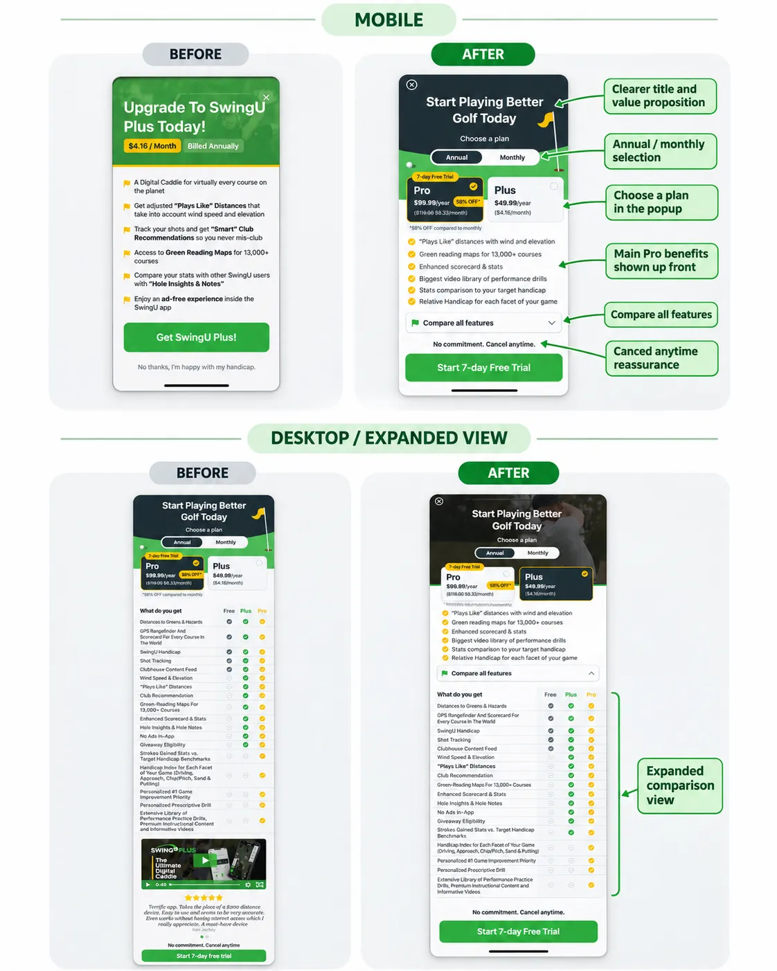
| Mobile Apps | Subscription comparisons, free-to-paid upgrade funnels | +24% CVR, +40% ARPU (SwingU) |
CVR = conversion rate; ARPU = average revenue per user.
For more detailed research, hypotheses, implementation screenshots, and additional results, explore our conversion rate optimization case study library.
Data-Driven Lead Generation CRO Examples
The following CRO examples demonstrate how improving booking flows, form usability, and service discovery can increase conversions and revenue.
Explore more Lead Generation CRO case studies from Conversion Rate Store.
1. +56% Conversion Rate With a Simpler Booking Flow
Industry: Education
Problem: GrantMe, an education advisory platform, was losing potential customers during its consultation booking process. Some visitors couldn't easily find the booking CTA, while others were confused by the scheduling interface or unsure what to expect from the call.
What CRS changed: We moved the booking CTA higher on the page, replaced the existing date and time selector with a clearer Calendly interface, explained the consultation process, and addressed privacy concerns. The redesigned page also made it clear that the introductory call was free.
Results: +56% booking-page conversion rate and +27% progress to date and time selection.
Takeaway: Booking-flow optimization isn't only about shortening forms. Making the value of a consultation clear and reducing scheduling uncertainty can be just as important.
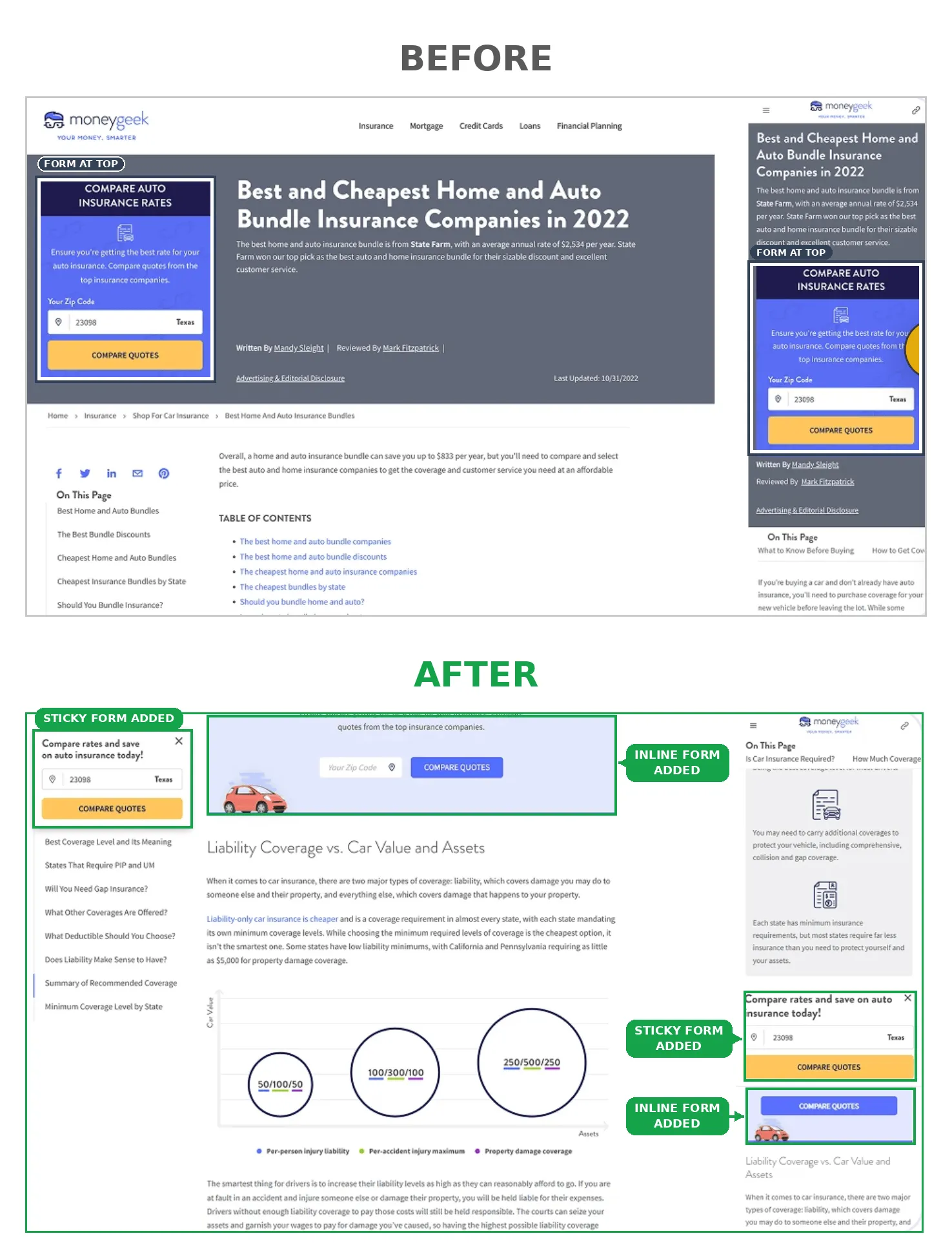
2. +20% Desktop Conversions With a Sticky CTA
Industry: Insurance / Financial Services
Problem: Visitors reading MoneyGeek's insurance articles often scrolled beyond the original "Compare Quotes" CTA. Those who decided to compare policies further down the page needed to scroll back to find the action.
What CRS changed: We introduced a dismissible sticky banner containing the "Compare Quotes" CTA. It remained available as users explored the page, allowing them to start the insurance comparison process without interrupting their reading.
Results: +20% desktop conversion rate and +18% mobile conversion rate, both reported with 95% statistical confidence.
Takeaway: On long, content-heavy pages, keeping a relevant conversion action accessible can improve lead generation without adding more intrusive pop-ups.
3. +11% Quote Conversions by Automatically Filling ZIP Codes
Industry: Insurance
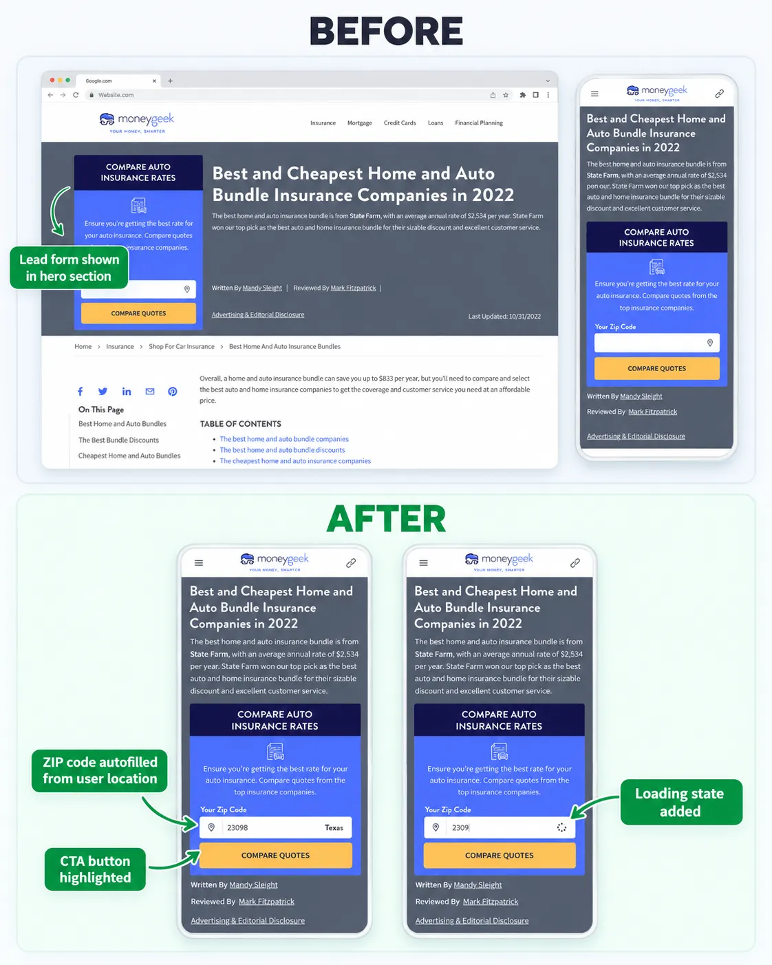
Problem: Visitors had to manually enter their ZIP code before comparing car insurance quotes. This additional step introduced errors and unnecessary effort.
What CRS changed: We tested location-based form prefill using an IP address API. The successful variation pre-populated an editable ZIP code field, reducing typing while allowing visitors to correct their location.
Results: +11% conversion rate to quote for the winning variation. A separate state-selection variation produced mixed results and did not deliver a statistically significant overall improvement.
Takeaway: Form optimization is about reducing effort, not simply removing fields. Prefilling accurate, editable information can help, but different interface variations still need testing.
4. +17% Search Progression With a Simpler Homepage
Industry: Online Education / Tutor Discovery Platform
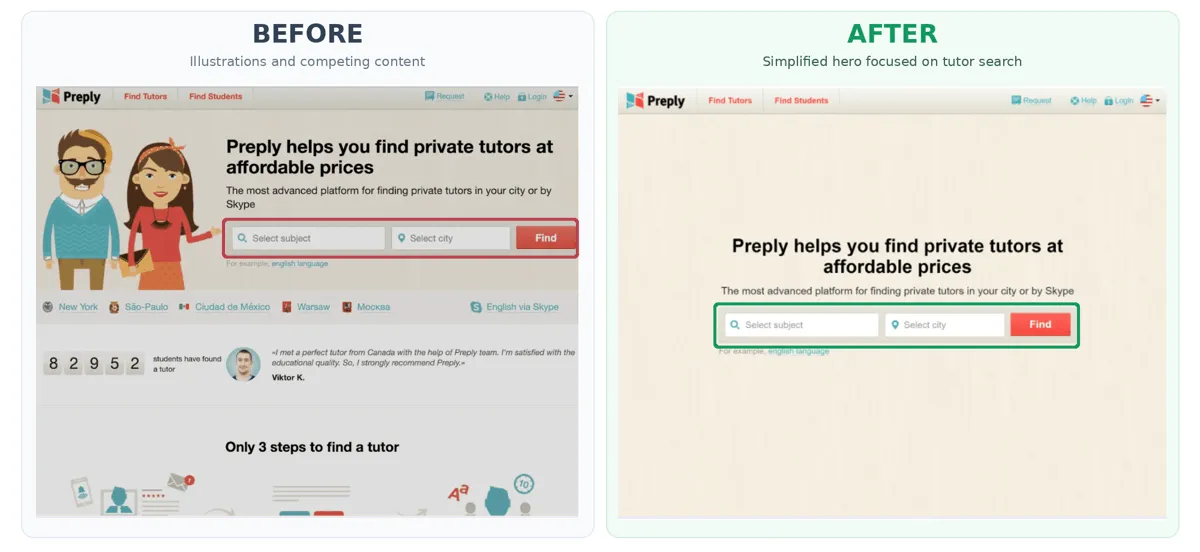
Problem: Preply's homepage contained elements that distracted visitors from its core conversion action: searching for a language tutor.
What CRS changed: We simplified the homepage and placed the tutor search experience prominently above the fold. Removing competing elements directed more attention toward discovering relevant tutors.
Results: +17% conversion from homepage visits to search results page views and +11% average revenue per user.
Takeaway: For service discovery platforms, making the primary search experience easier to access can improve funnel progression and revenue without requiring a complete redesign.
5. +30% Revenue Per User by Showing Trusted Contractors Earlier
Industry: Service Marketplace
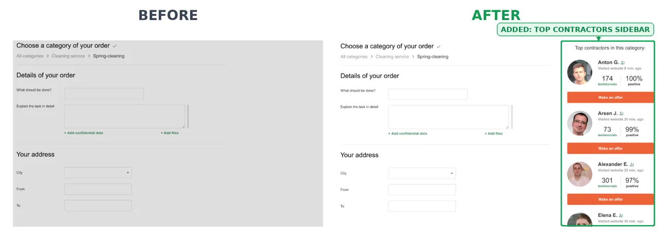
Problem: Some Kabanchik visitors hesitated to post a job because they weren't sure whether qualified, trustworthy contractors were available.
What CRS changed: We introduced a "Popular Contractors in This Category" section directly within the job posting flow. It displayed relevant, highly rated providers and offered an alternative way to contact them.
Results: +30% average revenue per user.
Takeaway: Trust is an important conversion factor in service-based lead generation. Showing credible providers before users commit to posting a request can reduce uncertainty and encourage engagement.
Shopify CRO Strategy Examples: Product Pages, Checkout, and Customer Confidence
The strategies below are relevant to Shopify stores and other direct-to-consumer eCommerce environments. Moon Magic's published case specifically identifies Shopify as its platform.
Explore more eCommerce and Shopify CRO examples from CRS.
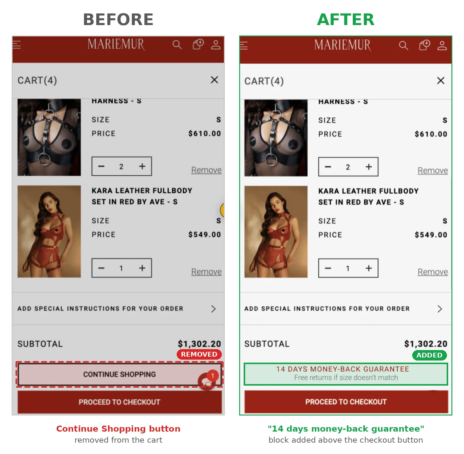
6. +29% Purchase Conversions With Clear Return Policy Messaging
Industry: Luxury Fashion / Lingerie
Problem: Mariemur experienced significant cart abandonment. Customer surveys revealed that some visitors were uncertain about sizing and unaware of the brand's return policy.
What CRS changed: Instead of introducing a discount or redesigning the checkout, we placed concise return-policy reassurance near the purchase decision. The message was localized: US customers saw information about free returns, while other markets received wording consistent with their applicable policy.
Results: +29% conversion to purchase, reported with 97% statistical significance.
Takeaway: Trust-related information can be more valuable than another promotional offer, especially for fashion and other products where customers worry about fit.
7. +23% Conversion Rate With Research-Driven Product Page Content
Industry: Health & Wellness / DTC eCommerce
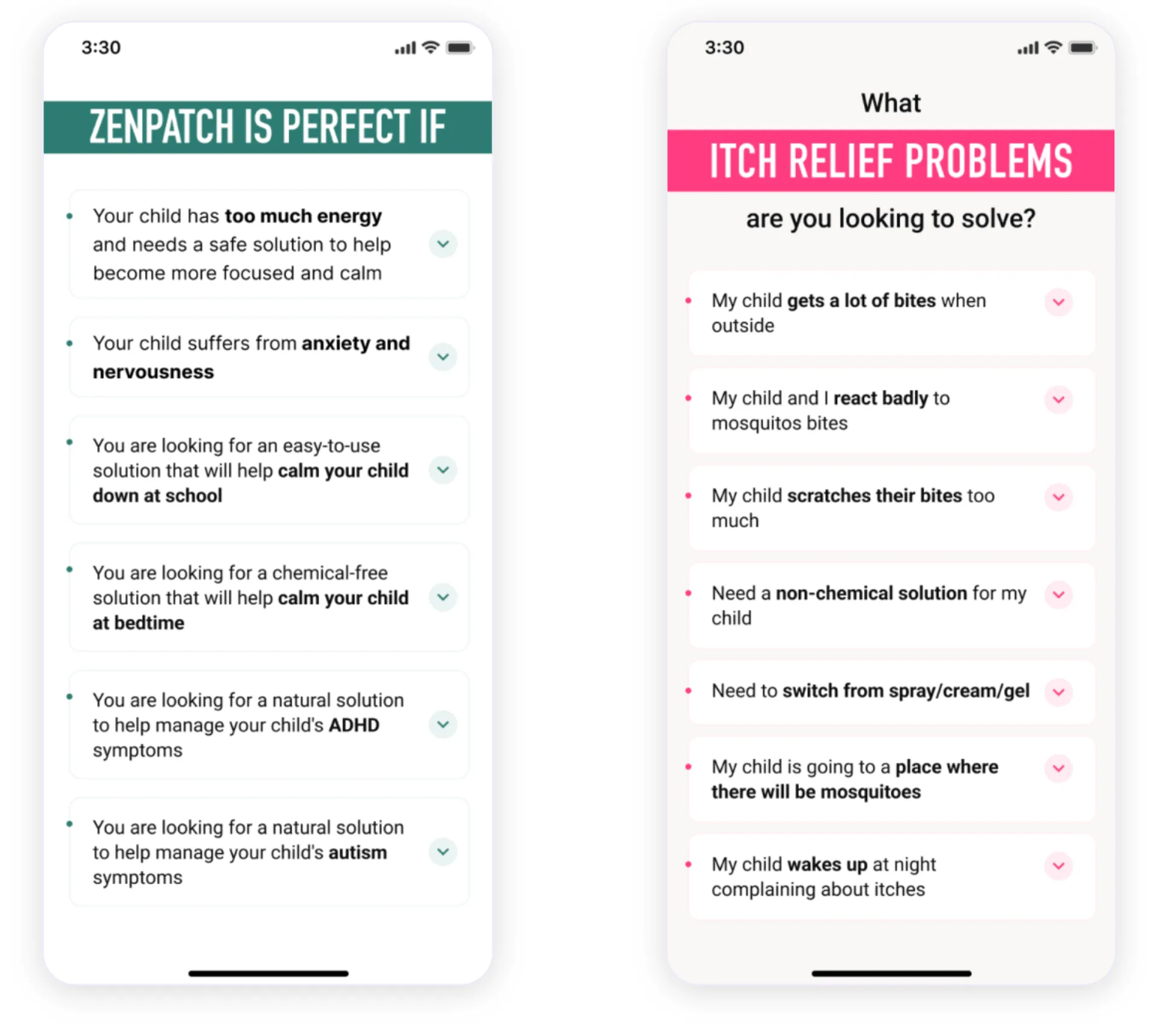
Problem: Some NATPAT visitors struggled to understand which wellness patches best matched their needs. Generic product messaging didn't adequately address individual customer concerns.
What CRS changed: We used customer survey findings to create personalized content blocks based on specific motivations and pain points. The redesigned product experience helped visitors identify relevant benefits without navigating through lengthy, generic descriptions.
An earlier iteration using non-buyer insights didn't produce a statistically significant improvement, so the team refined its approach using buyer research.
Results: +23% conversion rate, +28% average revenue per user, and +5% average order value for the reported SleepyPatch experiment.
Takeaway: Product page personalization should start with customer research. The most useful content answers the questions shoppers actually have before purchasing.
8. +7% Mobile Conversions With Sticky Product Customization
Industry: Jewelry
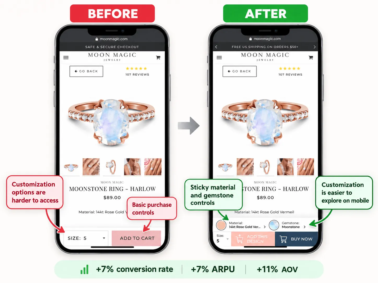
Problem: Moon Magic shoppers frequently purchased jewelry in multiple variations, but mobile users had limited access to customization controls while scrolling through product pages.
What CRS changed: We added sticky customization buttons within the mobile thumb zone, helping shoppers switch between metals and gemstones without repeatedly navigating the page.
Results: +7% conversion rate, +11% average order value, and +7% average revenue per user.
Takeaway: One of the most practical Shopify CRO strategy examples is improving access to features customers already value. Better mobile product customization can affect both purchase conversions and basket size.
eCommerce CRO Examples: Product Discovery, Homepage UX, and Cart Abandonment
Shoppers may abandon their journey because they can't identify the right product, don't understand its benefits, overlook relevant product recommendations, or leave to compare alternatives elsewhere.
These eCommerce CRO examples cover product discovery, homepage optimization, recommendation placement, and cart abandonment across online stores and large retail platforms.
Explore more eCommerce CRO success stories from Conversion Rate Store.
9. +12% Purchase Conversions by Simplifying Product Selection
Industry: Automotive
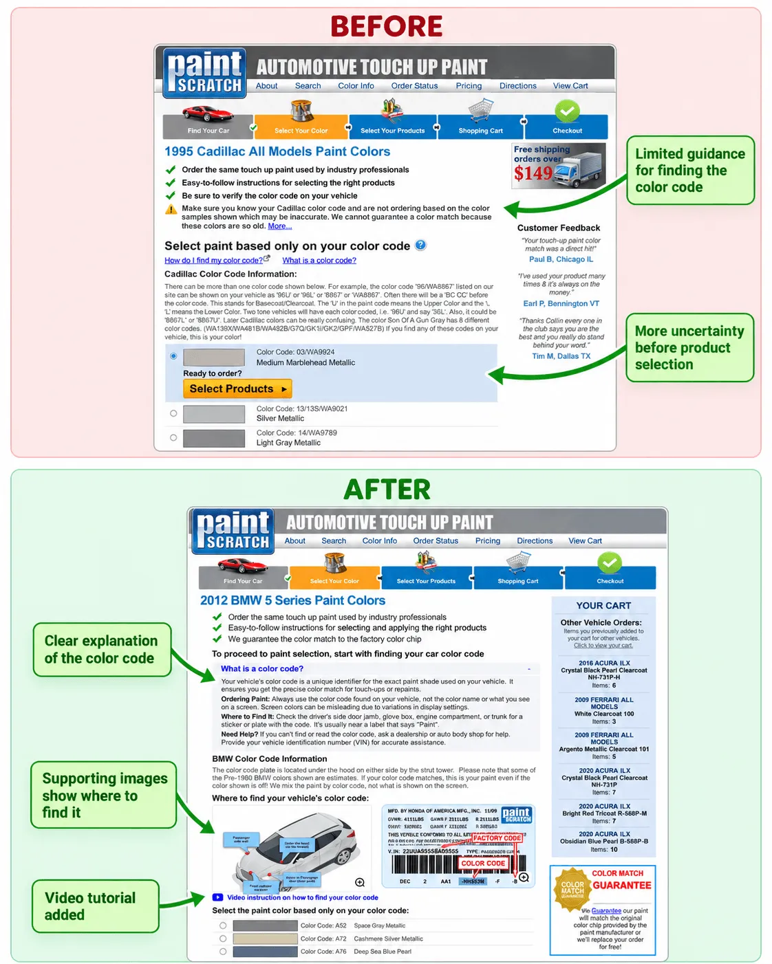
Problem: PaintScratch customers needed to identify the correct color code before purchasing automotive touch-up paint. Without clear instructions, many were unsure how to select the right product.
What CRS changed: We introduced car-brand-specific color code guidance, visual instructions, and a video tutorial showing where to find the relevant paint information.
Results: +12% conversion rate, +24% average revenue per user, and +13% average order value.
Takeaway: When customers must select technically specific products, educational content can become a direct conversion tool. Helping them make the right choice reduces uncertainty and supports purchases.
10. +23% Mobile Conversion Rate After Improving Homepage Messaging
Industry: Health & Wellness
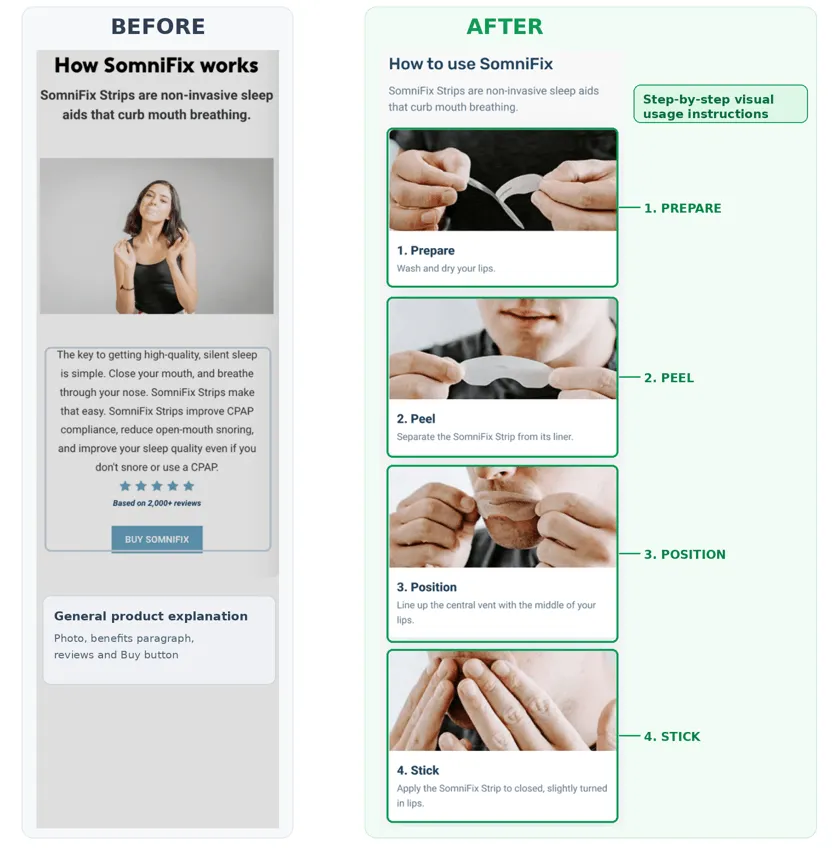
Problem: SomniFix visitors didn't always understand the product's benefits or how it worked. User testing highlighted unanswered questions and friction between homepage content and the purchase journey.
What CRS changed: We redesigned the homepage to explain the product more clearly, added FAQs, supporting evidence, product diagrams, testimonials, and a sticky mobile purchase CTA.
Importantly, the first variation performed worse than the original experience. We revised the journey, replacing a slide-in product experience with navigation to the full product page.
Results: The successful mobile iteration delivered +23% conversion rate and +32% average revenue per user.
Takeaway: CRO is iterative. An unsuccessful first test can reveal which part of the customer journey needs further improvement.
11. +6% Revenue Per User With Better Product Recommendations
Industry: Multi-Vendor eCommerce Platform
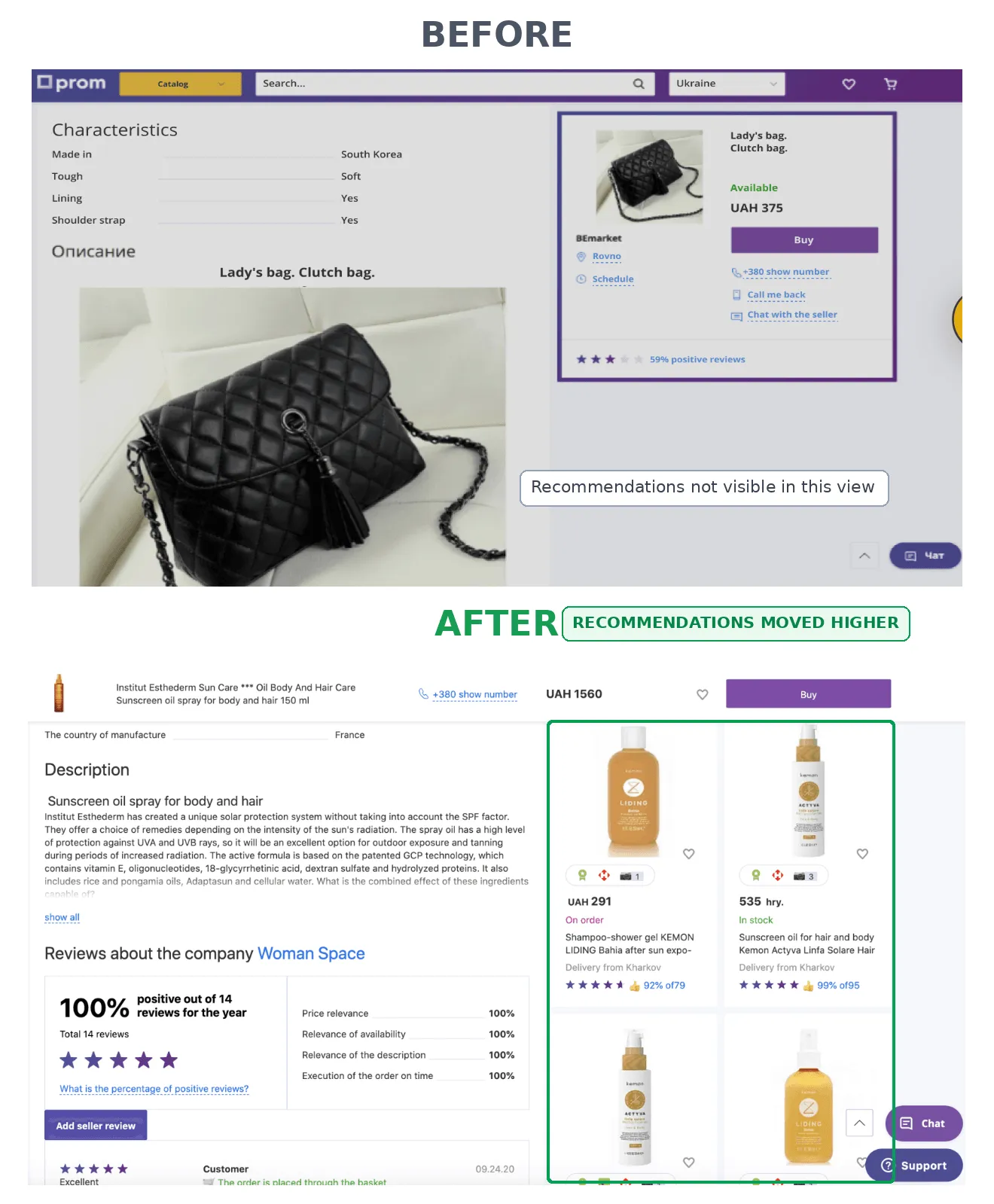
Problem: Prom.ua displayed recommended products too far down its product detail pages. Scroll analysis showed that 75% of visitors did not see the recommendation block.
What CRS changed: We moved recommendations from approximately the fifth screen to the second screen, increasing their visibility and encouraging users to explore additional product listings.
Results: +700% engagement with the recommended products block and +6% average revenue per user.
Takeaway: Product recommendation placement can influence revenue even without directly optimizing checkout completion. Making relevant products easier to discover creates additional opportunities for purchases and engagement.
12. +7% Purchase Conversions With an Exit-Intent Cart Reminder
Industry: Consumer Electronics / Large-Scale eCommerce
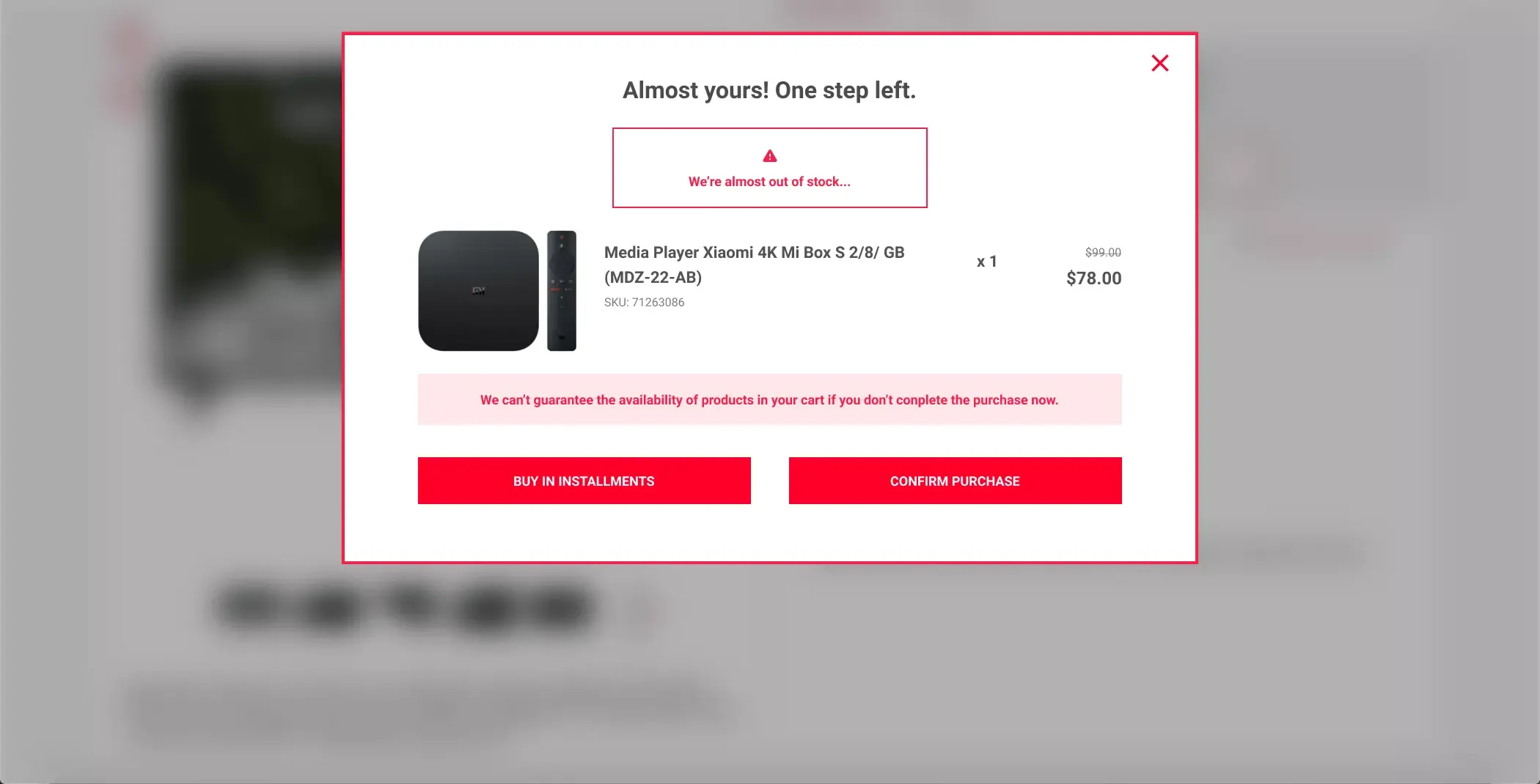
Problem: Many Eldorado.ua shoppers added products to their carts but left the website before completing their purchase, sometimes to compare competitors' prices.
What CRS changed: We implemented an exit-intent pop-up for visitors who already had products in their cart. It displayed their selected items alongside contextual product availability messaging and a clear action to continue purchasing.
Results: +7% conversion rate and +4% average revenue per user.
Takeaway: An exit-intent message can be more useful when it reflects the shopper's current purchase decision rather than presenting the same generic promotion to everyone.
B2B SaaS CRO Examples: Improving Leads and Sign-Ups
B2B SaaS conversion rate optimization often focuses on a different challenge from retail: visitors need to understand a potentially complex product before they can justify requesting a demo or creating an account.
Effective SaaS CRO strategies connect the product's value to the user's immediate problem.
Explore our B2B SaaS conversion optimization case studies.
13. +17.5% Lead Conversion With a Clearer Cybersecurity Landing Page
Industry: Cybersecurity
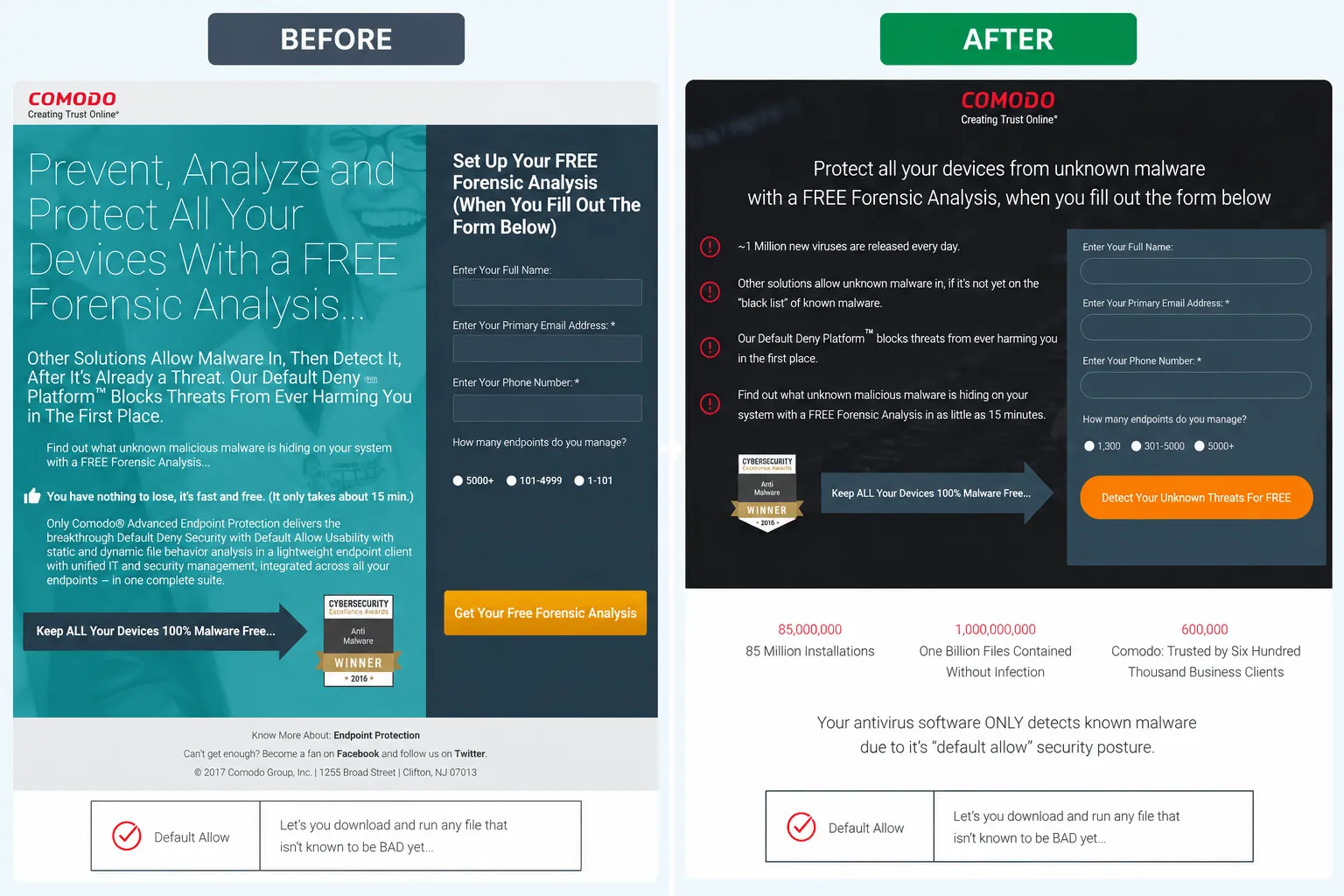
Problem: Comodo's landing page converted visitors at an already high rate, but user research identified several barriers: technical jargon, unclear benefits, and unanswered questions about the free forensic analysis offer.
What CRS changed: We redesigned the landing page with clearer, pain-driven messaging explaining cybersecurity risks, the value of forensic analysis, and what visitors could expect from the service. The new version also included reassuring information and FAQs.
Results: +17.5% visitor-to-lead conversion rate.
Takeaway: Even high-converting B2B SaaS landing pages can benefit from better messaging. Translating complex technical features into customer outcomes can make an offer more persuasive.
14. +81% Sign-Ups by Showing Product Value Before Registration
Industry: Website Localization
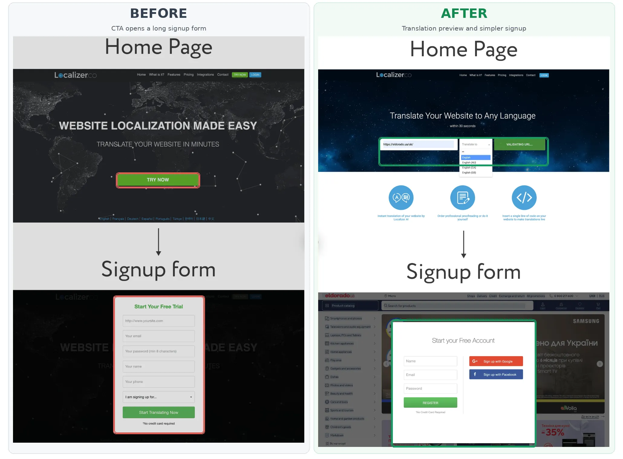
Problem: Localizer visitors were asked to register before they could understand what the translation tool would deliver. Many abandoned the sign-up process.
What CRS changed: We redesigned the homepage so users could enter their website URL and select a language before registering. The registration form appeared alongside a preview of their translated website, helping users see the product's value at the moment they were asked to create an account.
Results: +81% conversion from homepage visits to registrations.
Measurement note: Because traffic was limited, this result came from a two-week before-and-after comparison following a full rollout, rather than a randomized A/B test.
Takeaway: For SaaS products, showing users a meaningful preview of the outcome can create stronger motivation to register. The measurement method matters when interpreting the reported uplift.
B2C SaaS and Digital Product CRO Examples: Subscriptions, Trust, and Registration
For subscription businesses and digital product platforms, a higher sign-up rate doesn't automatically mean more revenue.
The critical questions are whether users understand the paid offer, how easily they can upgrade, and whether registration supports or interrupts their immediate goal.
These CRO success stories cover premium upgrades, homepage trust, free-trial optimization, and registration experiences.
Explore more B2C SaaS conversion optimization examples from CRS.
15. +173% Content-to-Paid Subscription Conversions
Industry: Fitness Subscriptions
Problem: DoYogaWithMe offered both free and premium yoga content. Many users consumed free classes without upgrading, while existing subscribers disproportionately selected monthly plans.
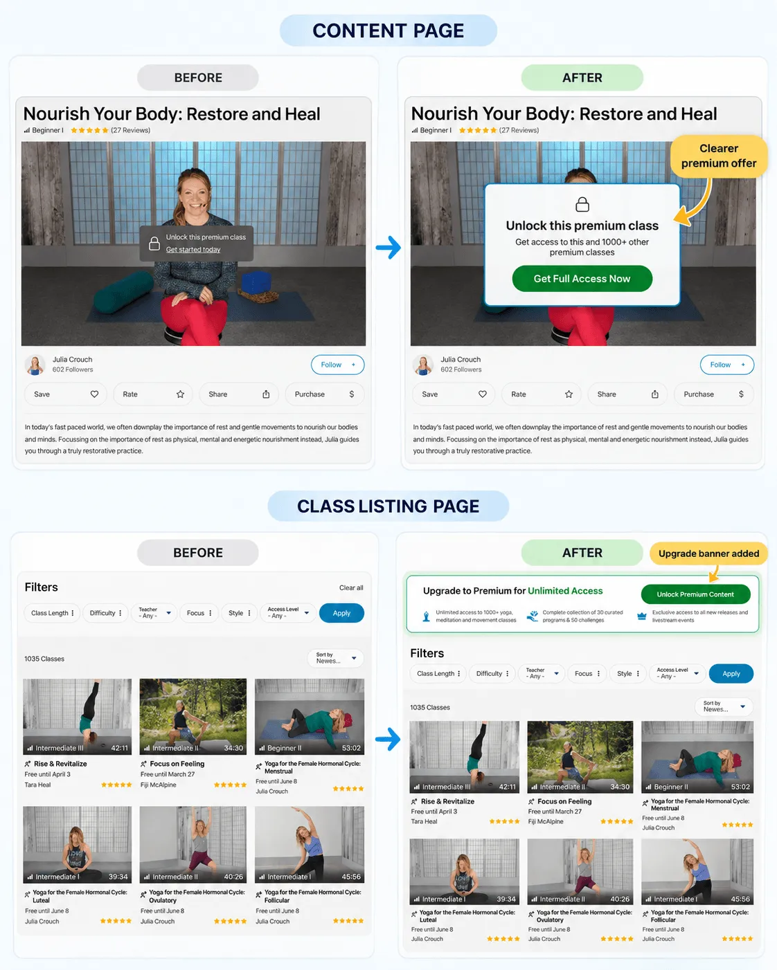
What CRS changed: We placed contextual upgrade banners across video and content pages, redesigned premium messaging, and introduced exit-intent offers for logged-in free users. These elements directed users toward premium plans and made annual subscription offers more visible.
Results: +173% conversion from content page views to paid subscriptions, +326% average revenue per user, and +56% average revenue per paying user. The annual plan share increased from 41.67% to 73.46%.
Takeaway: The right subscription offer must appear at the right moment. Showing relevant upgrade opportunities within the content experience can outperform relying on a pricing page alone.
16. +20% Conversion Rate With Trust-Focused Homepage Design
Industry: Desktop Software
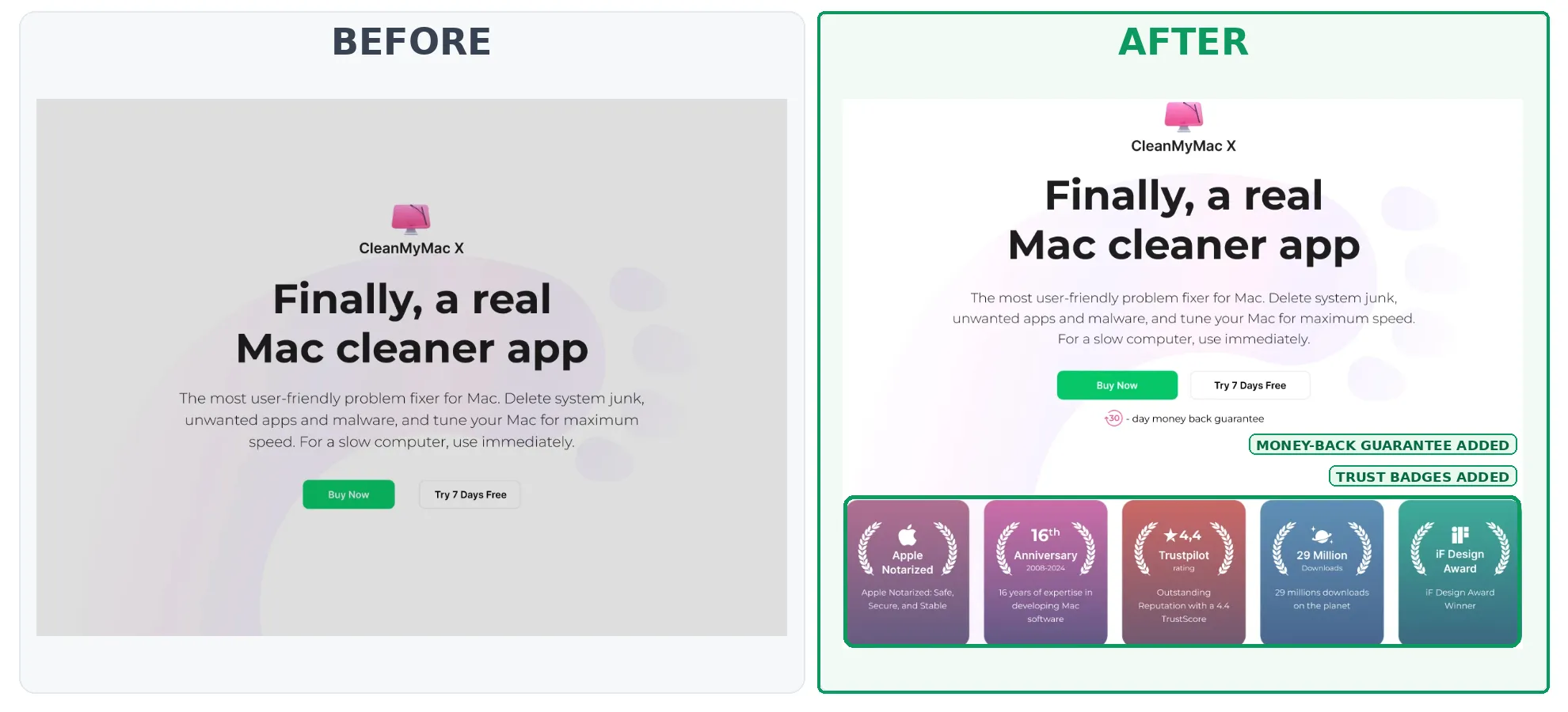
Problem: CleanMyMac visitors had concerns about trust and didn't always understand how the product would solve problems such as slow performance or limited storage space.
What CRS changed: We redesigned key homepage sections with a stronger focus on real user problems. The new experience included trust indicators, a money-back guarantee, external credibility signals, and benefit-oriented messaging instead of relying primarily on feature descriptions.
Results: +20% conversion rate and +19% average revenue per user.
Takeaway: Software conversion optimization should help visitors understand both what the product does and why they can trust it.
17. +86% Visitor-to-Paid Conversions After Changing the Free Trial
Industry: Subscription Meal Planning
Problem: Cooksmarts offered free trials without requesting payment information upfront. This made trial registration easy but didn't necessarily attract users who would become paying subscribers.
What CRS changed: We tested requiring credit card information at the beginning of the free trial rather than at the end.
Results: Free-trial registrations fell by 63%, but trial-to-paid conversion increased by 91%. Overall visitor-to-paid conversion rose by 86%.
Takeaway: Optimizing a subscription funnel solely for free-trial volume can be misleading. A decrease in one funnel metric may be acceptable when the final paid conversion rate improves substantially.
18. +9% Registration Conversions With a Contextual Sign-Up Form
Industry: Digital Content Platform / Stock Photography
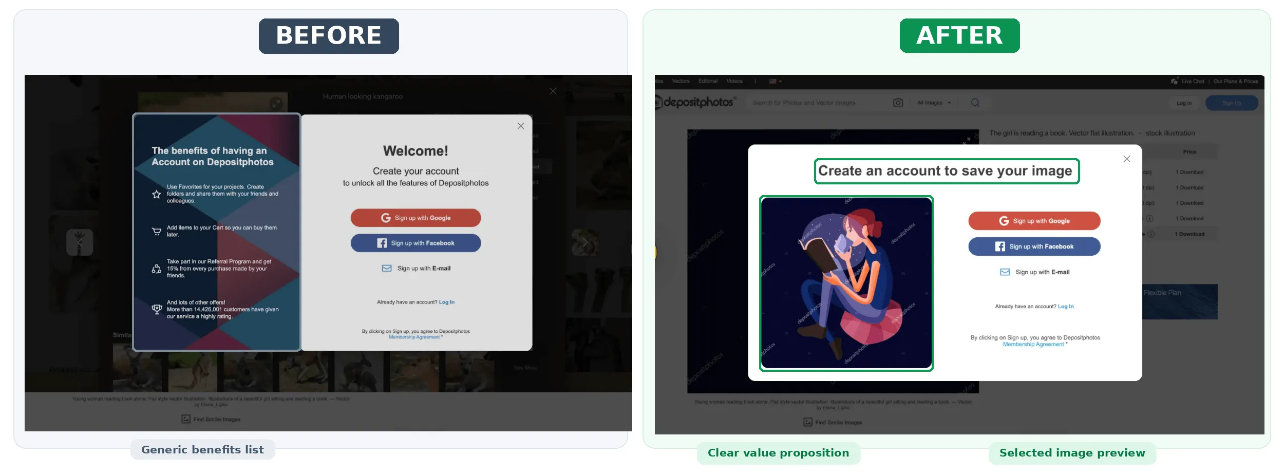
Problem: Depositphotos users frequently reached registration after selecting an image to download. The generic account creation message didn't clearly connect registration to their immediate goal.
What CRS changed: We redesigned the registration pop-up to display the image the visitor had selected, making it clear why account creation was necessary to complete the download process.
Results: +9% conversion to registration and +8% average revenue per user.
Takeaway: Registration feels less like an interruption when users can clearly see how it helps them complete an action they already intended to take. This principle is relevant to digital products and SaaS sign-up flows.
Mobile Conversion Optimization Examples: Simplifying In-App Purchases
Mobile CRO extends beyond responsive website design. In mobile applications, subscription screens, onboarding flows, and upgrade steps directly affect revenue.
Explore all Mobile App CRO case studies from CRS.
19. +24% Subscription Conversions With a Shorter Upgrade Funnel
Industry: Sports Technology
Problem: SwingU's free-to-paid subscription journey included multiple screens, repeated messaging, and a complicated plan comparison experience.
What CRS changed: We reduced the upgrade funnel from three steps to two, redesigned the plan comparison table, and improved the visibility of premium benefits. A collapsible interface let users compare plans at a glance or explore more detailed features.
Results: +24% conversion rate and +40% average revenue per user, alongside +13% average revenue per paying user.
Takeaway: Reducing unnecessary actions and making subscription differences easier to understand can improve mobile app monetization.
How Can I Find a СRO Agency With Verified Case Studies?
If you're looking for a website conversion rate optimization agency serving businesses in the US, start by reviewing its published experiments rather than relying only on testimonials, agency rankings, or promised conversion uplifts.
Look for CRO agencies that can demonstrate:
- Published experiments with named clients: Real examples identifying the business, conversion challenge, and changes made.
- Measurable conversion and revenue results: Improvements in conversion rate, revenue per visitor, qualified leads, or paid subscriptions, not just clicks or engagement.
- Transparent experimentation methods: Clear explanations of hypotheses, A/B testing, statistical confidence, and limitations.
- Relevant industry experience: Proven work with eCommerce, SaaS, lead generation, or other business models similar to yours.
- End-to-end CRO capabilities: Research, analytics, UX/UI design, experiment development, QA, and performance evaluation.
Conversion Rate Store is a CRO agency serving businesses targeting the US market, with published experiments across eCommerce, marketplace, SaaS, lead generation, and mobile apps.
For example, CRS helped MoneyGeek, a US personal finance platform, increase desktop conversions by 20% through a sticky insurance comparison CTA. Another MoneyGeek experiment increased conversion to insurance quotes by 11% through ZIP code prefill.
You can also explore our full CRO case study library to review experiments by industry.
Landing Page Conversion Optimization Examples: What Actually Changed?
| Landing Page | Conversion Problem | Optimization | Reported Result |
|---|---|---|---|
| Comodo | Complex cybersecurity messaging | Pain-driven copy, clearer offer, FAQs | +17.5% visitor-to-lead CVR |
| GrantMe | Booking friction and unclear expectations | Visible CTA, simpler scheduling, trust information | +56% booking-page CVR |
| CleanMyMac | Weak trust and value communication | Reassurance, customer-focused messaging | +20% CVR |
| Localizer | Users couldn't evaluate value before registration | Product preview within the sign-up journey | +81% sign-up CVR (before/after comparison) |
These examples suggest three practical priorities for landing page conversion optimization:
- Clarify the value proposition. Help users understand what they receive, how it works, and why it matters.
- Remove decision-making friction. Make primary actions visible and simplify difficult steps.
- Address specific objections. Use customer research to identify uncertainty around pricing, trust, product benefits, or the next step.
The correct approach depends on the audience and business model. A B2B demo page, an education consultation funnel, and a consumer software homepage require different conversion definitions.
What Can Businesses Learn From These CRO Testing Examples?
Across the 19 experiments, several patterns stand out.
1. Customer research often reveals problems that analytics alone cannot explain
Mariemur's conversion barriers became clearer after surveying shoppers about sizing and returns. NATPAT used buyer research to develop more relevant product messaging.
2. Reducing friction can matter more than adding features
MoneyGeek simplified ZIP code entry, GrantMe improved consultation scheduling, and SwingU removed unnecessary upgrade steps.
3. Revenue metrics should be considered alongside conversion rates
Prom.ua improved ARPU through recommendation engagement, while Cooksmarts accepted fewer free-trial sign-ups in exchange for more paid customers. A higher conversion rate is not always the final business goal.
4. Not every test wins
SomniFix improved performance after an unsuccessful first variation. NATPAT refined its research inputs after an earlier iteration failed to deliver a significant result. Documenting unsuccessful tests can help teams avoid repeating unproductive ideas.
5. The same CRO tactic can work differently across businesses
Sticky CTAs, personalized content, registration changes, and exit-intent offers should be treated as hypotheses rather than guaranteed improvements.
How to Apply These Conversion Optimization Examples to Your Website
The best way to learn from CRO examples is to understand the customer problem behind the intervention.
Start by identifying a specific funnel drop-off or business metric: purchase conversion, revenue per visitor, qualified leads, paid subscriptions, or another measurable outcome.
Next, combine quantitative data with customer research. Review funnel progression, user behavior, surveys, and any recurring objections.
Develop a hypothesis that connects the identified problem to a proposed change. Define the primary outcome and supporting or guardrail metrics before running the experiment.
Where practical, validate the change through a properly designed A/B test. If a randomized test isn't feasible, document the alternative measurement method and its limitations. Then evaluate results, including possible negative effects on revenue or downstream conversion.
For businesses that need a more structured starting point, our CRO audit guide explains how to identify and prioritize conversion barriers.
Final Thoughts: What These CRO Success Stories Have in Common
The strongest conversion rate optimization strategies aren't necessarily the most complicated.
For Mariemur, it was clearer return-policy messaging. For MoneyGeek, it was easier access to a relevant conversion action. For Preply, it was a simpler homepage. For DoYogaWithMe, it was showing premium upgrade offers at meaningful moments.
Across eCommerce, SaaS, lead generation, digital platforms, and mobile apps, the common approach is to identify a real source of customer friction and measure whether solving it improves the business outcome.
Conversion Rate Store combines behavioral research, UX/UI design, analytics, development, and experimentation to help businesses improve conversion performance.
Explore our published CRO experiments or contact Conversion Rate Store to discuss optimization opportunities for your website or app.
Frequently Asked Questions About CRO Examples
What Are Some Real-World Examples of Conversion Rate Optimization?
Real-world CRO examples include Mariemur improving purchase conversions by 29% through clearer return messaging, GrantMe increasing booking-page conversions by 56% through scheduling improvements, and Preply increasing progression to tutor search results by 17% through homepage simplification.
Other examples include optimizing SaaS sign-up forms, improving product recommendations, simplifying free-to-paid upgrade funnels, and testing subscription pricing experiences.
What's the Difference Between CRO Examples and CRO Case Studies?
A CRO example demonstrates a specific optimization technique and its result.
A CRO case study usually provides more detailed context, including the initial problem, research, hypotheses, implementation, measurement approach, and conclusions.
This article summarizes individual conversion optimization examples.
Which Metrics Should CRO Case Studies Include?
Useful CRO evidence includes the primary conversion metric, the business outcome, and any relevant supporting metrics.
For eCommerce, these may include purchase CVR, average order value, and revenue per visitor. For B2B SaaS and lead generation, they may include demo requests, qualified leads, registrations, and pipeline conversion. Subscription businesses should also consider paid conversion and average revenue per user.
When evaluating results, confirm whether the reported uplift is relative or absolute, whether the test was randomized, and what the measurement period covered.
Can CRO Results From One Company Be Replicated on Another Website?
Not necessarily. CRO results depend on user intent, product positioning, audience characteristics, traffic sources, page context, and existing performance.
The most reliable approach is to use published examples to generate hypotheses, then validate those hypotheses with research and experimentation on your own website.