
Key Takeaway
By reducing the steps required for users to progress from free trial to paid membership, we streamlined the conversion funnel, resulting in a 24% increase in conversion rate and a 40% increase in average revenue per user. This approach balanced intuitive, emotional decision-making (System 1 thinking) with logical, in-depth analysis (System 2 thinking), ensuring a seamless and engaging user experience.
Client Overview
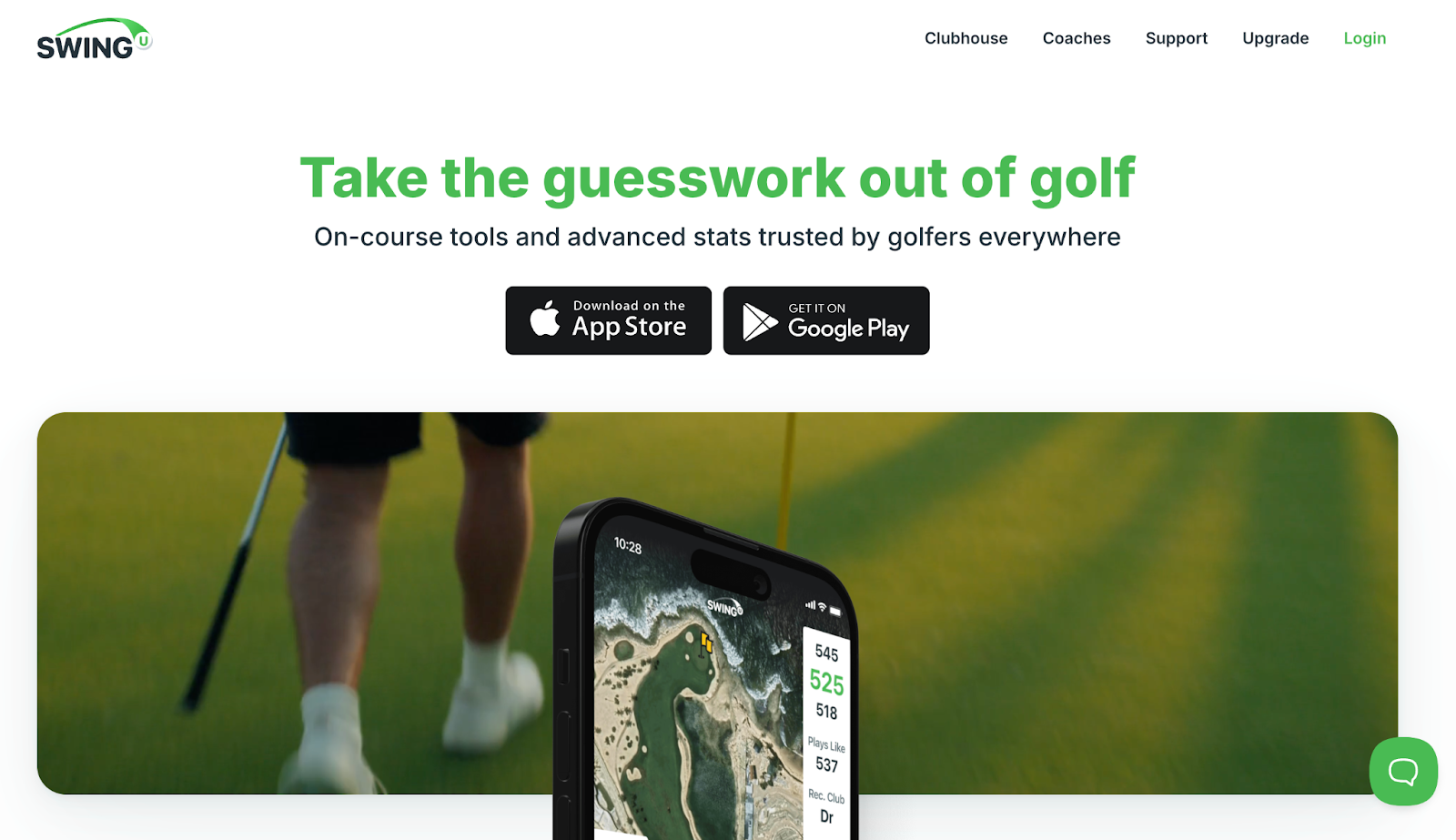
SwingU is a top-rated golf app providing rangefinding, scorekeeping, and performance insights for over 7 million users worldwide. The platform enhances the golfing experience with precise shot tracking and strategic play guidance, making it a trusted companion for golfers of all levels.
Opportunity Background
SwingU's app required users to complete multiple steps to upgrade from a free trial to a paid plan. Although a previous experiment had reduced the original four-step funnel to three steps by merging the promotion and plan selection pages, drop-offs still occurred. These findings presented an opportunity to optimize the funnel further by reducing steps, clarifying messaging, and simplifying decision-making to encourage faster progression.
Note:
Solution
Quantitative research and session recordings revealed inefficiencies in the process and highlighted key friction points. Users found the upgrade pop-up redundant and unclear, with repetitive messages and confusing calls to action. The distinction between Free, Plus, and Pro plans wasn't communicated early enough, leading to confusion and increased cognitive load. The multi-step process required too many actions, which discouraged conversions.
To address these issues, we made targeted changes to improve user engagement and progress, including:
- Collapsed funnel stepsWe replaced the original Upgrade Pop-up with a redesigned comparison table page, merging the promotion and plan selection steps. This reduced the funnel from three steps to two, minimizing user actions and lowering cognitive load.
- Enhanced comparison table UIWe introduced a dropdown UI for the comparison table, allowing users to toggle between a simplified view of key features and a detailed breakdown of all plan benefits. This design appealed to both quick decision-makers and users seeking in-depth analysis.
- Fear of loss messagingTo drive urgency, we added dynamic elements, such as displaying the total number of active users, creating a sense of competition and fear of missing out on exclusive benefits.
- Improved visual hierarchyKey features of the most desirable plans were positioned above the fold in the collapsed table view, ensuring they were immediately visible and compelling to users.
Results
The streamlined funnel delivered statistically significant improvements:
These results demonstrated the effectiveness of reducing funnel steps, simplifying decision-making, and leveraging dynamic visuals to engage users emotionally and logically.