Key Takeaway
By adding sticky customization buttons to mobile product pages, Moonmagic.com increased average revenue per user by 7%, average order value by 11%, and conversion rate by 7%. The change made jewelry variations, such as metal type and gemstone, more accessible and encouraged multi-variant purchases in a single session.
Client Overview
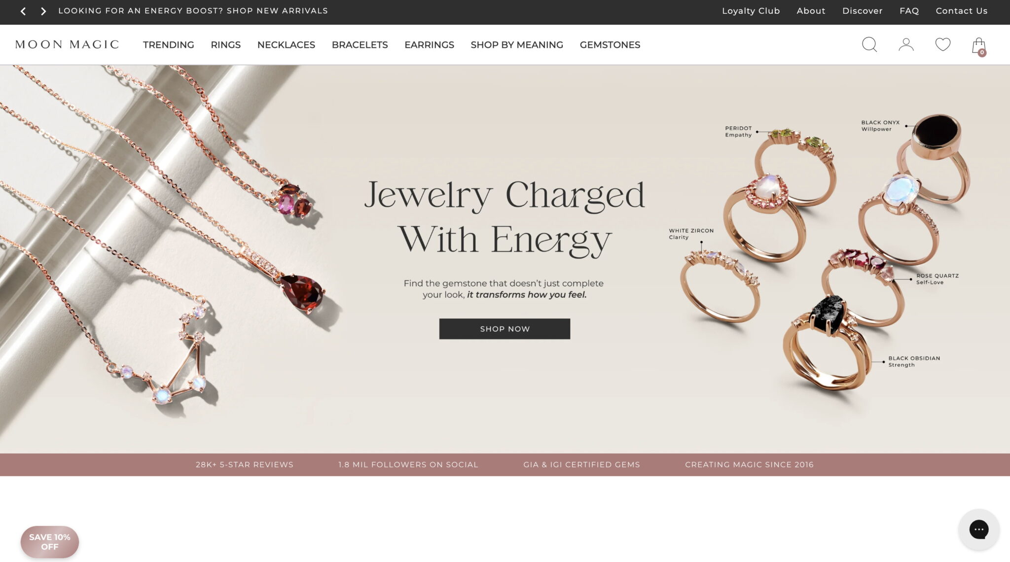
Moonmagic.com is a high-growth direct-to-consumer jewelry brand offering rings, necklaces, earrings, and more. With over 430,000 monthly sessions (according to Similarweb), the brand generates the majority of its traffic through paid digital channels and serves a global customer base through its Shopify store.

Opportunity Background
User behaviour analysis revealed a recurring pattern: some shoppers bought multiple versions of the same piece of jewelry, such as a ring in both gold with a diamond and silver with an opal. Around 7% of transactions involved repeat purchases of the same basic product with different customisations. These multi-variant shoppers had the highest ARPU across all user segments. However, the customization interface on mobile product pages was not optimized for usability or visibility, which likely limited this behavior.
Solution
To make customization options more accessible and reduce friction, we introduced sticky buttons in the thumb zone of the mobile product pages. These buttons allowed users to quickly select metal and gemstone types, while making it clear that multiple variations were available. The new layout brought customization to the front of the decision-making process, encouraging users to explore and purchase multiple versions of the same item.
Results
The updated mobile product detail page with sticky customization buttons led to a 7% increase in average revenue per user, a 11% increase in average order value, and a 7% increase in conversion rate. It also led to a 6% increase in average units per transaction, confirming that easier access to customization encouraged multi-variant purchases.