Key Takeaway
By redesigning the homepage experience to preview product functionality before account creation, Localizer.co increased user sign-up rate by 81%. Showing value upfront reduced drop-off and improved user motivation to register.
Client Overview
Localizer.co is a SaaS platform that enables businesses to translate their websites into multiple languages with a single code snippet. Designed for companies expanding into international markets, the tool simplifies localization by automating website translation into any target language.

Opportunity Background
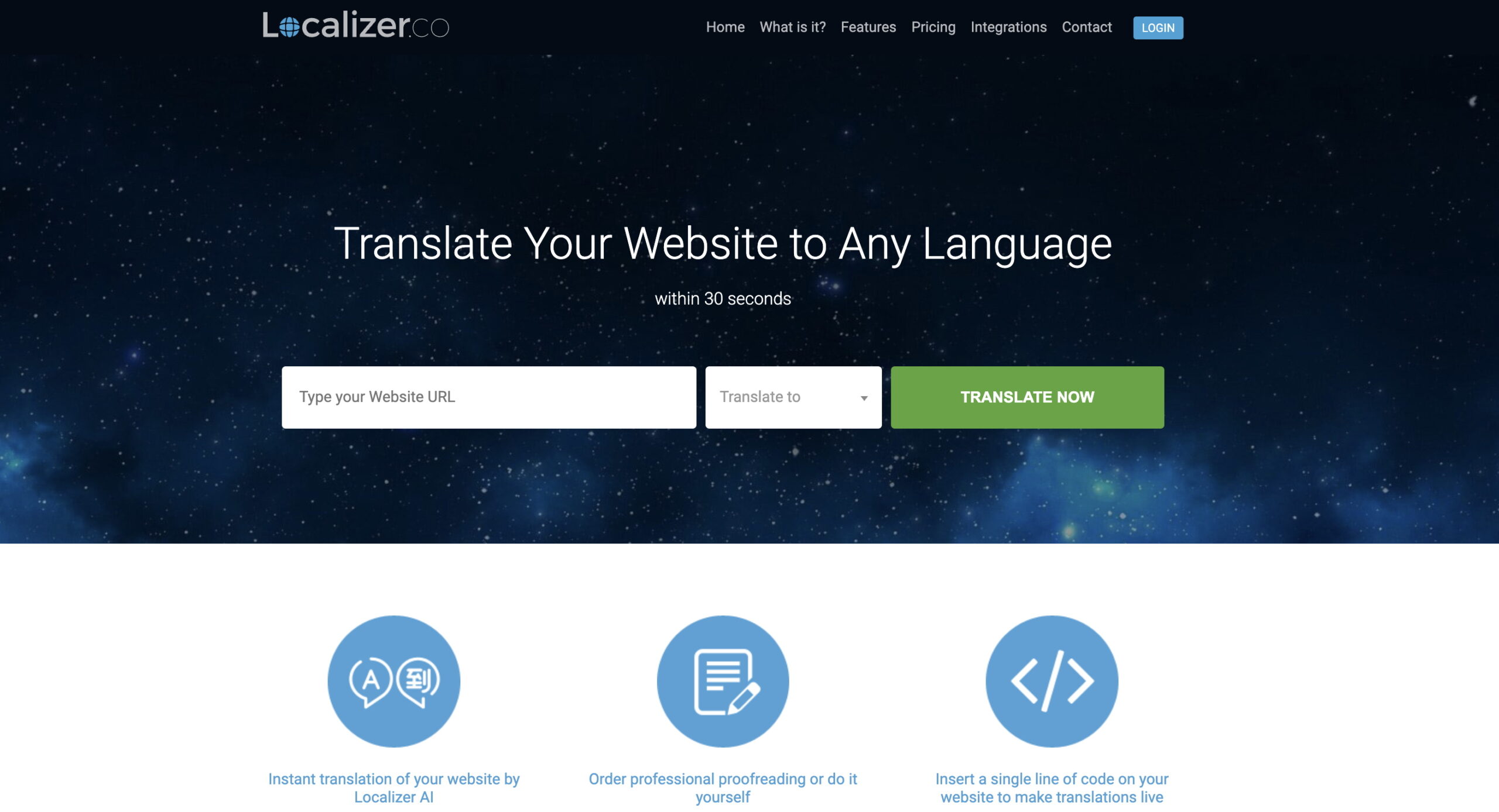
Our goal was to increase user registrations, the first step toward growing Localizer’s paying customer base. Funnel analysis showed that while the homepage attracted significant user engagement, the majority of users who clicked the “Try Now” call-to-action did not complete the signup process.
User research revealed that users didn’t clearly understand what they would gain by signing up. In addition, the signup form felt overwhelming, as it requested information too early in the user journey. As a result, most users exited the funnel without interacting with the registration form.
Solution
To reduce drop-off and communicate value earlier, we redesigned both the homepage and the signup experience. On the updated homepage, users were prompted to enter their website URL and a target language. After clicking “See Your Translation,” they were taken to a signup form overlaid on a live preview of their translated website.
This approach gave users a first-hand experience of the platform's core benefits before completing the registration process. By aligning registration with the immediate delivery of value, we reduced hesitation and made the process feel more rewarding and relevant.
Due to limited traffic, the new flow was rolled out to 100% of users and performance was measured by comparing results two weeks before and after implementation.
Results
The new sign-up flow led to an 81% increase in the conversion rate from homepage visits to successful user registrations. By providing an early product preview and reducing cognitive friction, the experience helped more users move confidently through the funnel.