Increase mobile app revenue by showcasing the value of subscription plans

Increasing the Perceived Value of In-App Paid Subscription Plans by Encouraging Comparisons

o'clock

Reading time: 6 min

Increase mobile app revenue by showcasing the value of subscription plans

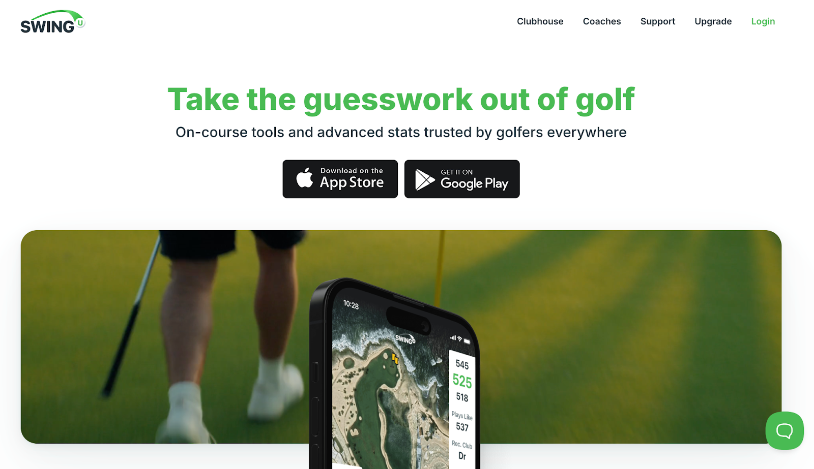
SwingU is a leading golf app that offers rangefinding and digital scorekeeping services. Created to offer users an enhanced golfing experience, the platform supports the golfing of over 6 million users worldwide. This includes offering precise distances, shot tracking, and strategic play insights for every course.

Key takeaway

Consumer attitudes towards apps are often defined by high expectations for free content and high resistance towards in-app purchases or paid memberships. This presents a problem for monetization. A staple in modern thought leadership, Daniel Kahneman’s Thinking Fast and Slow is an essential primer for anyone who wants to understand how effective use of comparison tables can counteract this issue. 

System 1 thinking (fast – emotionally volatile thinking) is what your users rely on whenever they take a negative knee-jerk reaction to your requests for monetization. However, when you correctly implement comparison tables into your funnel, you can push users into system 2 (slow – logical and analytical) thinking by drawing their attention to the limitations of your free membership, and contrasting them against the many features and benefits of your paid membership. 

From this, users can overcome their initial negative biases, and begin to see that opting for your paid memberships would be the most rational and constructive decision – thereby significantly increasing in-app conversion rates and ARPU.

Positioning your most expensive deal as your most cost-effective deal is an effective way to increase revenue.

+14.23%ARPU
99.9 %Significance

Preliminary Information:

The average app churn rate for a paid subscription over 30 days is more than 71%. The average revenue per user for a paid app is roughly $0.70 cents.

The above reveals a harsh truth – people dislike paying for apps. For whatever reason, the perceived value of an app membership tends to be extremely low, especially when compared to other forms of consumerism.

So, any app that wishes to capture paid users needs to be able to prove its value immediately.

laptop
laptop

What we liked most about SwingU is that the app delivers essential tools to a niche audience. First, the tools they offer are crucial for modern golfing, therefore positioning their app as more of a ‘must have’ rather than just a ‘nice to have’. Secondly, they serve an audience that is traditionally very wealthy.

So, the question we needed to ask is how can we help SwingU emphasize the value of their in-app purchases even further?

Research & Insights:

Flow Walkthrough:

Previously, users had to progress through four stages to subscribe to SwingU. The stages were as followed:

  1. Pop-up Stage – the flaws we discovered in this stage are explored in a follow-up hypothesis that you can find here:

  2. The Promotion Page that offers the paid subscription plans (Plus & Pro) – the flaws we discovered on this page were:

    • The scroll depth required for users to reach the comparison table was too high.

    • Users who did not view the comparison table would not be exposed to a clear reason to upgrade.

    • The table was ineffective at forcing comparisons because it did not include a column for the free plan. (Only paid plans were compared)

    • Prices were not listed, making it impossible for users to gauge value or cost-effectiveness.

    • The UI had poor visual contrast. This made it difficult for users to consume or engage with persuasive bits of information.

  3. The second page lets you select your paid subscription plan (Plus or Pro) – and the flaws we found are listed below:

    • Users could progress to this page without ever viewing the comparison table. Which meant they would be asked to make a decision without the necessary information.

    • On this page, differentiation between the two plans was minimal. Limited to the names of the plan, and a six word subheading.

  4. The payment stage – unaffected and unchanged.

quotes

There’s an age old saying in sales that reads:

If a user can skip information they will. So any data that’s crucial for a specific decision should be displayed immediately.

Quantitative Research:

  1. An email survey was conducted to discover which features users valued most and which features needed to be rephrased for clarity or even removed. We would use this data to inform the creation of an optimized comparison table:

  2. Additionally, we conducted UX Research to discover how users felt about the current comparison table. User sentiments were as follows:

    • Users appreciated that the comparison table helped them match each paid plan to their particular needs.

    • Users struggled to figure out which features came with a free plan, and which required a paid plan.

    • Users felt that the lack of pricing reduced their ability to make an informed decision. Additionally, it created a sense of suspicion/ anxiety.

    • Users felt that some features lacked clarity.

Hypothesis:

Based on the friction points and barriers to conversion that we discovered in our research phase, we developed the following hypothesis:

If we make the comparison table the most visible on-screen element, and improve the way that it organizes and communicates information, then we expect that users will find it easier to justify the purchase of a paid plan over the free plan. Additionally, condensing the Plan Promotion Page & Plan Selection Page will reduce the amount of actions that users need to take before committing. These two changes combined should reduce friction and confusion, thereby increasing conversion rate and ARPU significantly.

Leaner Funnel Progression – Reduce the number of steps required to complete a task:

  1. We expect to minimize barriers to conversion by combining the Plan Promotion Page & Plan Selection page into one. This will reduce the number of actions that users need to perform to subscribe to a plan, thereby increasing their likelihood of conversion.

  2. We expect to increase the percentage of users who choose the Pro Plan (most expensive plan) by having it as the pre-selected option on the page.

    • Users are likely to think that the default choice is the most popular choice, and while this is clearly a logical fallacy, playing into this bias will allow you to increase your percentage of higher-priced sales.

    people

    Gain-Loss Clarity – Make the offer and the cost as clear as possible:

  3. Users will understand the offer better if we change the page’s headline from “Get every advantage on the course with SwingU Plus” to “Start Playing Better Golf Today”. This will communicate the value of the page and subscription upgrades more effectively, thereby incentivizing users to continue reading.

  4. We expect to justify the economics of each plan by listing prices in a weekly & yearly format, and showcasing how bigger purchases (yearly subscription, more expensive Pro subscription) will be more cost-efficient due to a built-in discount that we will highlight.

    • Having prices listed clearly can foster trust. If you obscure your prices then at best, your users will be confused, and at worst, they’ll be suspicious and suspect that you may be hiding something. This can lead to immediate churn. Instead, consider giving users the price in every possible format (week, month, yearly).

    Cognitive Load Management – Minimize the amount of information people need to process at once:

  5. User buying emotions will increase if we make the comparison table visible from the first-screen and add a column for the free plan so that users can immediately see the ways that a paid membership will be superior to free membership.

    • Placing the ‘free’ option on the left and the ‘most expensive’ option on the right allows you to frame a clear progression from ‘least useful’ to ‘most useful’ (and by extension, most desirable.)

  6. Users will find it easier to judge the paid plans as superior if we move highly desirable features to the top of the table, exclude confusing or irrelevant features, and improve the overall UI by giving the table better contrasting colors and more legible text sizes.

    • The primacy effect states that people are more likely to remember the first items in a list over anything else. Because of this, you always want to have the most impactful features listed first, and put anything less impactful in the middle.

  7. Users will engage with the CTA at a higher rate if we make it a large green button with copy that promotes the 7 day free trial for the Pro Plan. This offer will be reinforced with risk reversing microcopy above the CTA that notes “No commitment. Cancel Anytime”. (Users who select the Plus Plan will instead see the word ‘Continue’).

    • Framing your CTA as a free trial allows you to ‘sweeten the deal’ at the last minute, increasing the likelihood that users progress.

    Content Hierarchy – Placing most important information first allows it to benefit from the Primacy Effect:

  8. More users will convert from the funnel if we move content such as videos and reviews to a lower point on the page. This is because this information is auxiliary – it’s not core to the experience of finding out which plan suits you best, but it can support your decision.

existing version A
existing version A
alternative version b

Results:

The overall conversion rate for users progressing from the upgrade screen to a paid plan increased by 0.51%. Despite this, we saw a sizable uptick in Average Revenue Per User (ARPU) – which rose by 14.23%, and Average Revenue Per Paying User (ARPPU) which rose by 13.66%.

This suggests that even though the overall conversion rate stayed relatively even, the percentage of users that opted for the most expensive Pro & Year membership plans increased significantly. This was reflected clearly in our findings, which revealed that the Yearly Pro membership’s selection rate soared by a significant 78%. This shift in distribution meant that the comparison table was highly effective at getting users to overcome their initial disdain for in-app purchases, and was also effective enough that one-third of users would entirely abandon any thoughts of price sensitivity as they instead found the most expensive option to be the most desirable and rational choice.

quotes

It’s all about how you frame it: The idea that something may be ‘too expensive’ is simply a game of perception.

Overall, we can conclude that this experiment was a resounding success. Not only because of the ARPU and ARPPU increase, but also because we clearly demonstrated how logic can be used to increase funnel progression. You can see these statistics below:

  • The conversion rate for users progressing from the Upgrade Promotion Page to the Choose a Plan stage increased by 25.31%

  • The conversion rate for users progressing from the Upgrade Promotion Page to a free or paid trial increased by 11.02%

  • The conversion rate for users progressing from a Free Trial to a Paid Subscription increased by 7.31%

Insights & Predictions:

We were pleased with the results generated by our first hypothesis. However, we felt confident that there was still room to improve on the initial experiment. The concept of expanding information consumption through comparisons and accelerating funnel progression by removing steps proved effective.

So we became confident that reapplying a similar formula to other stages of the SwingU funnel, and augmenting them with UI changes that increased user agency, could lead to even more significant improvement to the key metrics in this case.

You can find the follow-up experiment where we tested this, (here.)

Also want such results as Split Case Study SwingU Part 1

Schedule a call with our analyst.
He will learn about your business and provide you with actionable recommendations

Get 3 CRO hypotheses for FREE

Pay only for actual funnel conversion rates growth based on A/B test results

Schedule a consultation
microsoft combinator
Schedule a consultationGet 3 Free CRO
recommendations for your funnel
Conversion Rate Store
Get a sample of CRO audit that will be relevant to your website


    Conversion Rate Store
    We will set up a 15 min call and give you the price of CRO retainer on the call


      Conversion Rate Store
      We will set up a 15 min call and give the price of CRO audit on the call


        Conversion Rate Store
        • Get 3 Free CRO recommendations for your site
        • Calculate CRO project ROI
        • Enquire about CRO project cost


          Conversion Rate Store

          Schedule a FREE consultation to get:

          • Actionable plan on how to increase needed metric
          • Industry-relevant case studies
          • Benchmarks of similar funnels to compare with competitors


            Conversion Rate Store
            Our leading CRO strategist will review your website, ask metrics on the call and give you 3 actionable recommendations on how to increase conversion rates for free.


              Conversion Rate Store
              • Get 3 Free CRO recommendations for your site
              • Calculate CRO project ROI
              • Enquire about CRO project cost


                Conversion Rate Store
                • Get 3 Free CRO recommendations for your site
                • Calculate CRO project ROI
                • Enquire about CRO project cost


                  Conversion Rate Store

                  Schedule a FREE consultation to get:

                  • Actionable plan on how to increase needed metric
                  • Industry-relevant case studies
                  • Benchmarks of similar funnels to compare with competitors


                    Conversion Rate Store

                    Schedule a FREE consultation to get:

                    • Actionable plan on how to increase needed metric
                    • Industry-relevant case studies1
                    • Benchmarks of similar funnels to compare with competitors


                      Conversion Rate Store
                      Send your CV

                        Your name

                        Your Surname

                        Descriptions

                        Your request has been received. We will contact you shortly.

                        Go to career page