Reading time: 6 min
How to increase lead generation form conversion rate through using IP address to auto-fill
MoneyGeek, founded in 2016, is dedicated to helping its users navigate the complications of finance by offering advice on everything from insurance, to credit cards, loans, mortgages, and college funding. By automatically analyzing hundreds of thousands of offers, MoneyGeek is able to direct its users to the most affordable or cost-effective financial services.
In this case study our focus will be the car insurance section of the website.
Key takeaway
Why ask your users to enter their data into an input field when you can auto-populate the answer for them? For MoneyGeek, a location input field created a barrier to conversion as users would have to stop, recall their zip code, and accurately type the answer into a textbox.
However, using an API to automatically resolve the location via IP address would allow users to enjoy a hassle-free experience where they can proceed to deeper stages of the funnel without having to worry about any of the details.
Preliminary Information:
In a previous experiment we increased user session time and conversion rate by adding a branded and UI optimized internal navigation menu. For further details on this, go here.
MoneyGeek’s advantage is that it serves an audience that ‘is extremely high intent. It collects its traffic via SEO, and all of its webpages use the same content to conversion mechanism structure.
This means that when you create a positive change on one webpage, it’s very easy to duplicate that change into every other webpage to create a sitewide advantage. This is especially powerful in MoneyGeek’s case given the fact that it’s audiences will always be super high intent – users will only land at an insurance comparison website when they’re actively looking to progress to the buying stage.
Research & Insights:
Flow Walkthrough:
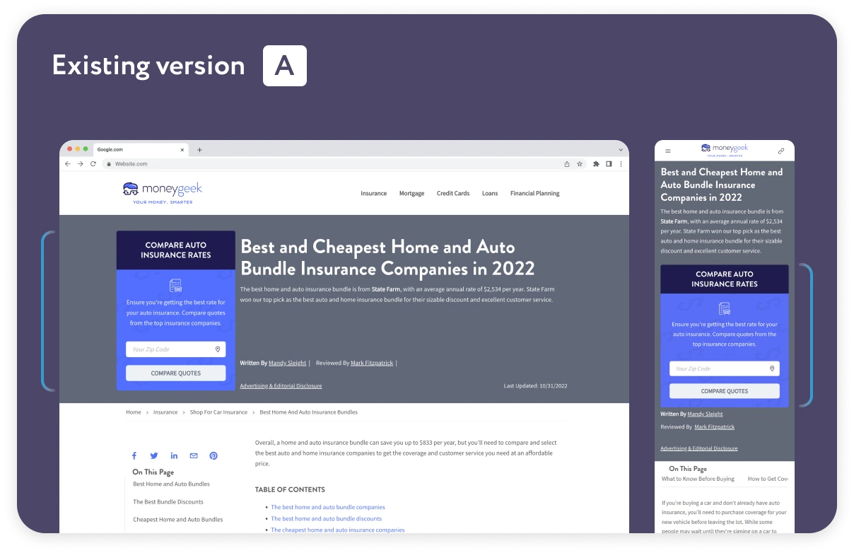
MoneyGeek gains a conversion when users fill out a location input field and click a CTA labelled ‘Compare Quotes’. This triggers a popup and progression to deeper stages of their price comparison funnel.
However, a blank input field meant that a noticeable amount of users would click the CTA but never proceed to the next stage.
This was likely due to an incorrectly entered location (ZIP code) but could also be the result of other factors such as internet problems or a simple decline in interest due to the gated progression.
From this, and competitive research which indicated that similar sites used a location field that was auto-populated, we knew that we would want to experiment with having an IP address API automatically resolve the ZIP code input field for users.
Hypothesis:
Based on the information we’ve gathered so far, we expect that by introducing an API that auto-populates the location input field by matching the IP address of a MoneyGeek users to a ZIP code, we’ll be able to increase the rate at which users progress through the funnel.
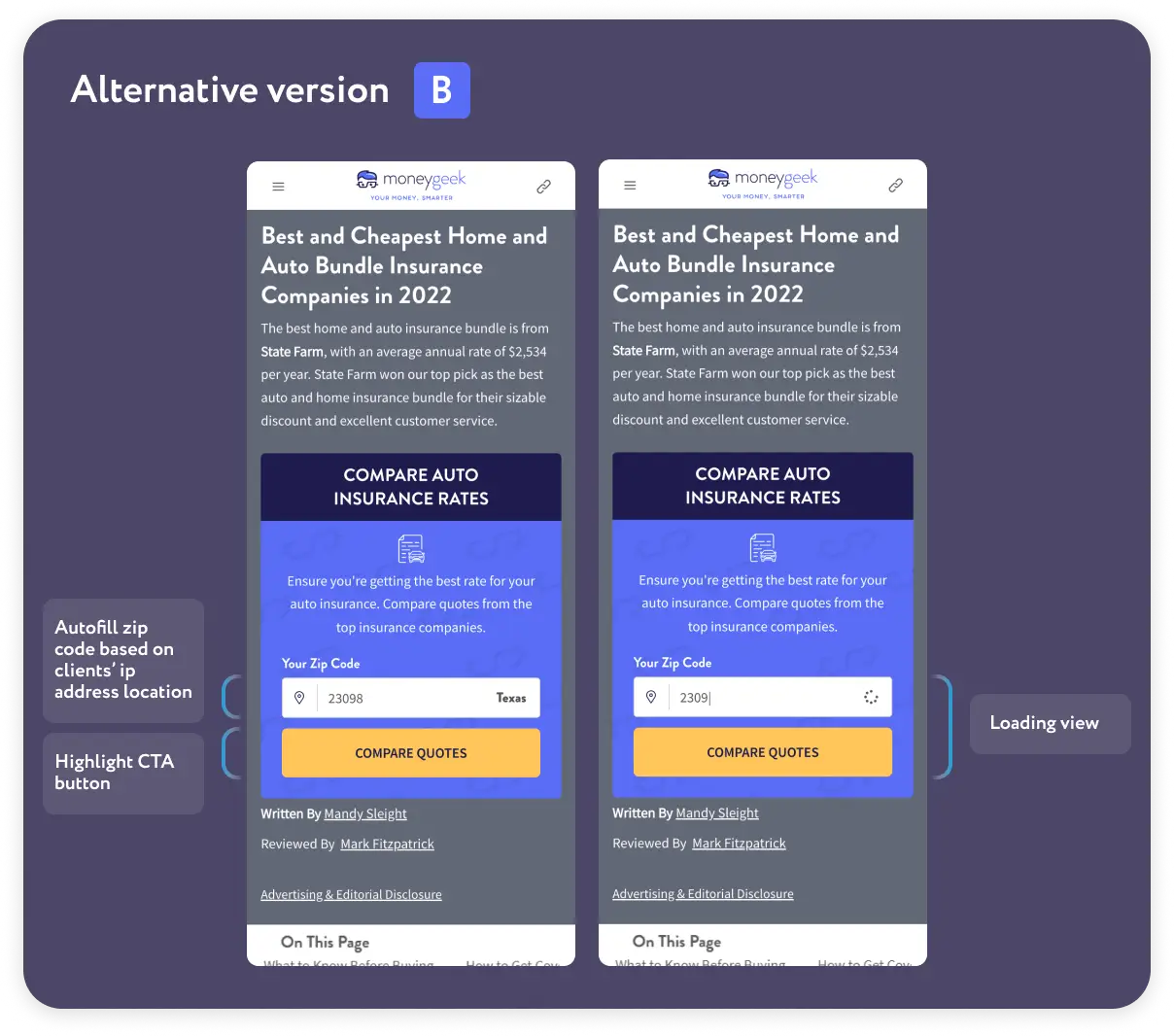
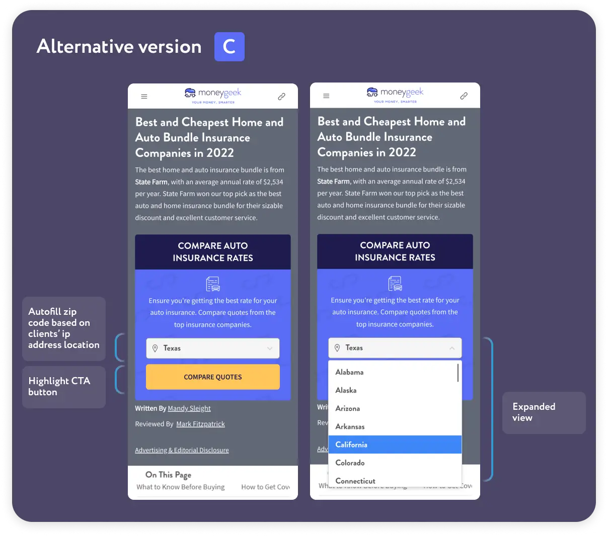
This would be a multivariate test with B and C alternatives. The changes to the Input Field Block were as follows:
When a user arrives at a page their location will automatically be entered into the input field (based on IP).
-
For Alternative B this location would be displayed as a ZIP Code number pre-entered into a text box.
-
The input field will display a blinking cursor to alert users to the fact that the automatically populated zip code can be edited to something else.
-
The input field will display a loading icon on the left hand side whenever there are less than 5 digits. This will prompt users to complete the input field in full.
-
For Alternative C this location would be displayed as a state pre-selected from a drop down menu.
-
The input field will have an arrow – signalling that there is an interactive dropdown element that users can use to change their state.
What effect do we expect these changes to have on users?
Positive:
-
Frictionless Conversion & User Convience: Rather than having to stop to input their ZIP Code, users can simply check that their location is correct and immediately tap the CTA. This reduces cognitive load and the amount of actions needed to achieve the desired outcome.
-
Clarity & Visual Hierarchy: The dropdown arrow, loading icon, and blinking cursor all draw attention to the input field. The faster we can draw users attention to this location, the quicker they can fill the input field (without mistakes) and progress.
-
Cunningham’s Law: Even if the Zipcode is wrong (Due to VPN use, changing IP addresses, changing locations, incorrect API, or other), the fact that there’s a pre-filled answer there will prompt users to correct anything that is incorrect. This is because when the brain sees something that is wrong, it has a strong desire to fix it.
Negative:
-
Skepticism: Some users will see an autopopulated location and find it to be intrusive. They will be suspicious of why and how their location has been acquired, and will churn. However, these users are far and inbetween. In the modern internet age people are used to being hyper-targeted. Google’s API automatically populates based on location, so your typical user will not find this change to be alarming.
Results:
On desktop the auto-populated location field was shown to 84% of users, and on mobile it was shown to 77% of users. (When a user did not receive an auto-populated field it is because the API failed to target them.)
In terms of performance, Variation B achieved a +12.22% increase in performance against the original page on desktop and a 6.5% increase on mobile. Totalled, this improved overall performance by 10.63% (95% Confidence 80% Power)
Variation C achieved a statistically insigifnicant 4.29% increase on desktop and a -8.66% decrease in performance on mobile. Overally this amounted to a statistically insigifcant +0.76% increase against the control.
We imagine that the more precise targeting of a zip code, as well as the visual hierarchy icons for the textbox input field created a better result and made variation B the clear winner.