Customers will default towards the cheapest product variant if you let them, but by highlighting
the value of
more expensive product variants, you can begin to use their price conscious behavior to your advantage.
The only caveat is that you’ll also raise price perception – so there’s a fine balance between trying to
raise
the AOV, and potentially hurting your CVR. Fortunately, when you do find the correct
balance, you’ll be
able
to safely increase revenue without more traffic.
How to redistribute sales towards more expensive product variants, increasing AOV and ARPU — without
negatively impacting conversion rate
+27%
AOV
+23.1%
ARPU
+20%
Share of subscription
Have you noticed that the smallest and cheapest variant of your product accounts for the majority of
transactions? If so, then it could be a sign that your users are overly price conscious, and tackling this
behavior can
allow you to redistribute sales towards more expensive variants, drastically increasing ARPU
and
AOV.
The risk with pushing customers towards more expensive variants is that it will raise the overall price
perception of your brand. Customers will see the more expensive variants first, feel that it is reflective
of your entire store’s price, gauge that it is too high, and immediately churn from the PDP without
clicking
for cheaper options, leading to a potential decline in CVR.
A strategic UI redesign with visual hierarchy would highlight the true value of more expensive variants,
and a double-tap-to-checkout feature would provide a faster and smoother checkout experience. The first
change was to increase AOV and subscription take-rate by making more expensive options more
valuable,
while
the second would aim to
reduce checkout friction and offset the potential CVR decline risks so that the
conversion rate stays stable
.
AOV increased by 27%. CVR decline was statistically insignificant (-3.25%). The
percentage of purchases
for
the cheapest variant was significantly reduced. The percentage of more expensive variants increased by
50%,
and 200%, respectively.
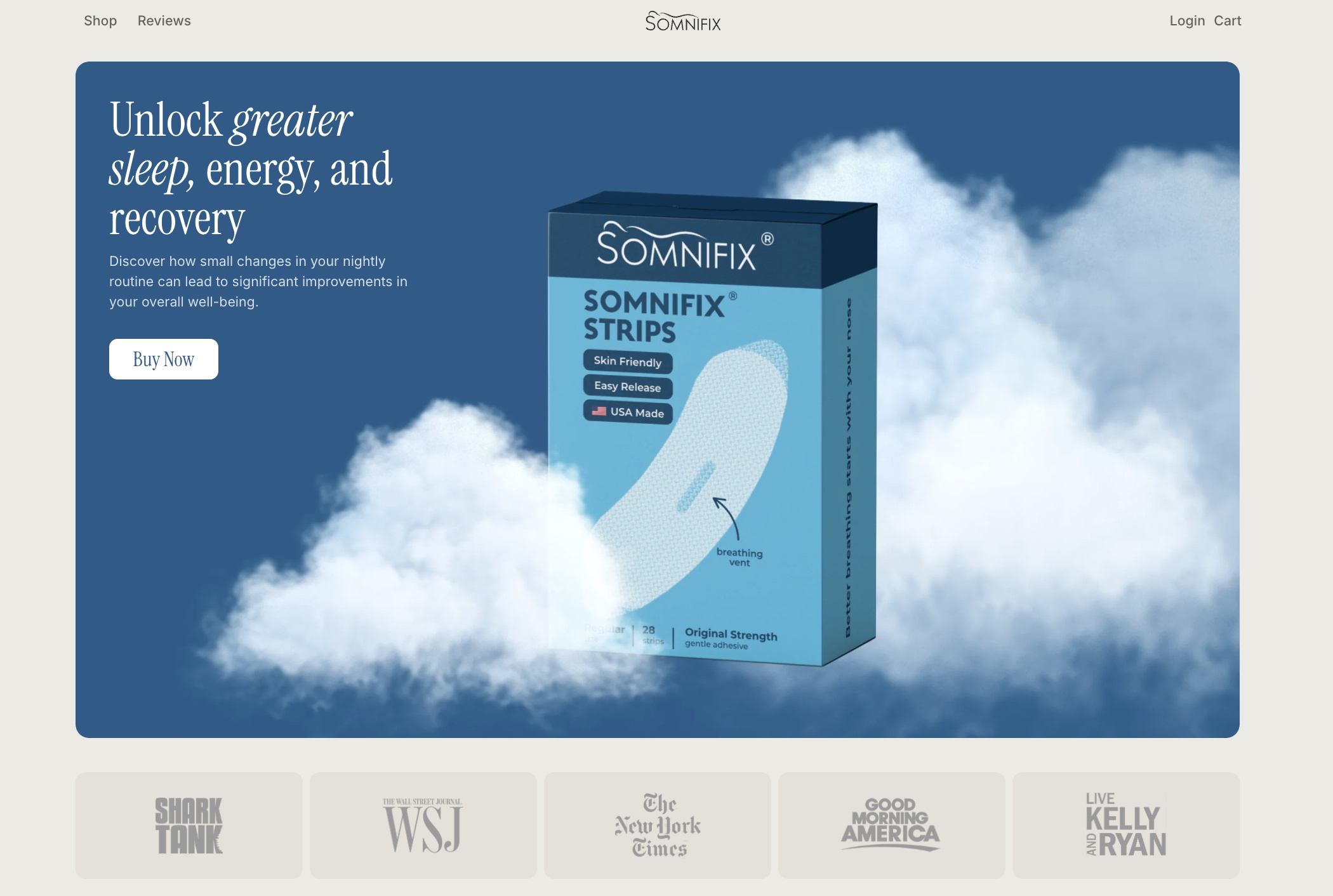
The client, SomniFix, is a single product online store that sells ‘Anti Mouth Breathing Strips’. These
are
pieces of disposable tape that can be placed over the mouth each night so as to eliminate mouth breathing
and promote healthier nasal-breathing while sleeping.
Our research revealed several analytical and data insights that we used as a foundation for our hypothesis.
Because of this, the smallest (1) Pack option accounted for a significant proportion of purchases.
Total prices were displayed, but the value breakdown was unclear, so customers were more likely to
default to the smallest product offering, even if it was less cost-effective.
This is because the (1) Pack had pre-selection, but Subscribe & Auto-Replenishment does not apply to
the
(1) Pack offer, so to get the subscribe block to appear you would have to manually select a larger
variant.
Based on insights into user behavior and perceptions, if we change the UI in accordance with the following
three points, we’ll be able to push customers to the 3 pack option, allowing us to
achieve a
higher
AOV while maintaining CVR.
This will create a clear visual hierarchy where the discounts, price, and benefits of the (3)
pack
option
are emphasized, allowing users to immediately see the value of larger pack options, increasing their
purchase share.
The negative consequence of this decision is that we expect SomniFix’s price perception to increase.
From
this, we’re likely to see a higher churn from the Product Display Page (PDP) where users will
immediately
see a higher price, and instead of clicking around for cheaper options, immediately eject.
However, we’re confident that overall the increase in AOV will compensate for the potential decline in
CVR, and as a result, we’ll still be able to positively impact the ARPU.
This would be the (3) pack option, and users who subscribe have a 2.56 higher CLTV than one-time
purchases.
This will create a faster, more frictionless checkout experience, creating a CVR increase that will
offset any potential decline. (This was to mimic how a user generally interacts with their smartphone –
by
double tapping anything they’re interested in.)
Before
After
Before
After
3 Pack | Control | Alternative | |
---|---|---|---|
Unique Purchases | 30.92% |
|
46.53% |
Quantity | 27.85% |
|
47.57% |
Revenue | 41.49% |
|
49.48% |
12 Pack | Control | Alternative | |
---|---|---|---|
Unique Purchases | 2.42% |
|
7.43% |
Quantity | 2.11% |
|
7.28% |
Revenue | 12.66% |
|
29.98% |
1 Pack | Control | Alternative | |
---|---|---|---|
Unique Purchases | 66.67% |
|
46.04% |
Quantity | 70.04% |
|
45.15% |
Revenue | 45.84% |
|
20.54% |
Experiment type: A/B Test
Traffic Split: 50:50
Key Metric: ARPU
Targeting Condition: Pricing Block & Checkout speed
Experiment type:
Traffic Split:
Key Metric:
Targeting Condition:
A/B Test
50:50
ARPU
Pricing Block & Checkout speed
Schedule a call with our analyst.
He will learn about your business and provide you with actionable recommendations
Schedule a FREE consultation to get: