Reading time: 6 min
How to increase e-commerce conversion by addressing key customer questions through content tailored to customer awareness stages
Key takeaway
A seamless user journey should feel a lot like mind reading. It’s all about anticipating your users’ thoughts, and matching their thinking process with the right information, in the right order, at the right time, step-for-step. Done correctly, and your users will discover the answers to their questions just as they think of them. Done incorrectly, and there will be informational gaps that leave your users wondering about some aspect of your product or store.
To rectify the latter, simply adjust the copy and visuals of your webpage and leverage visual hierarchy to emphasize the core messaging.
By doing this, all visitors can become informed users, and their higher stage of awareness will create buying intentions that increase your store’s conversion rate.
The сlient
SomniFix is a single product store focused on improving breathing and sleep quality. Their flagship product, the SomniFix® Mouth Strip, was developed by a physician who noticed that both he and his patients were suffering from the side effects of poor breathing. To tackle this, he created a brand of patented, non-invasive strips that gently hold the lips closed to ensure nasal breathing at night.
Preliminary Information:
Recent studies indicate that 71% of people mouth-breathe occasionally, and 31% chronically. Due to this, it could be said that SomniFix is a product that is geared towards fixing a ‘silent’ epidemic.
This makes the product a ‘must-have’ for anyone who is in need of breathing support (CPAP compliance) or who is interested in science-backed methods for a health conscious lifestyle.
Research & Insights:
Flow Walkthrough:
Users would progress from SomniFix’s Homepage through to a Product Detail Page, and then finally to the Cart & Checkout page.
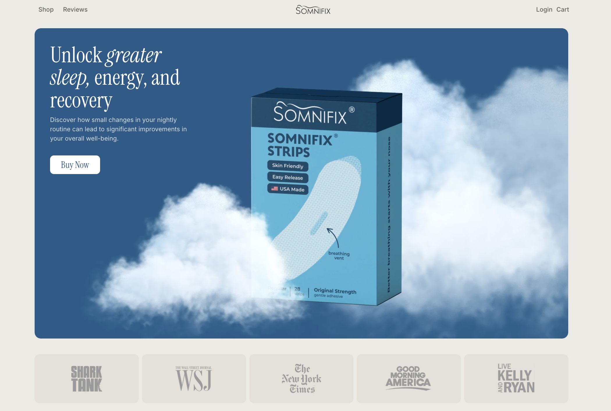
Previously, the homepage had the following elements:
-
A hero section
-
A problem block
-
A section explaining why mouth breathing is bad
-
A section explaining how SomniFix works
-
A section explaining why it works
-
Finally a credibility section of reviews and ‘featured in’ badges.
What we identified is that an abnormal amount of users (in comparison to benchmarks and predictive modeling) were dropping off at the homepage and failing to progress to the product detail page or checkout.
Additionally, only a very small percentage of users on mobile and desktop would interact with the buttons on the homepage.
-
For mobile, this issue was complicated further by the fact that hardly any users would click on the “Buy SomniFix” button positioned in the Hero Section. Conversely, this was the top interaction for Desktop users, showing that there was an imbalance between the two UIs.
Insights from User Testing:
Via user testing, we discovered the following flaws / opportunities for improvement:
-
Users desired a video tutorial that demonstrates how the mouth strips should be used
-
Users questioned whether the mouth strips stay on all night and if they’re safe
-
Users desired a more scientific explanation of how the product functions and its effectiveness
-
Users were concerned about whether the strip is one-size-fits-all or if there are different sizes
-
Users question whether the strip is reusable and about the product’s cost
-
Users would experience suboptimal visual clarity due to color contrast issues on the page.
From assessing all of our research, we came to the conclusion that there were clear informational gaps that were leading users to drop off, and creating suboptimal conditions for funnel progression.
Additionally, we felt that the page design wasn’t consistent enough, and could be adjusted to better highlight core messaging.
Hypothesis
Based on the insights from our research phase, we developed the following hypothesis:
If we modify the copy and design to plug informational gaps and emphasize core messaging, and address certain web dev accessibility issues, we can reduce barriers to conversion and significantly improve the performance of the SomniFix homepage / landing page.
Control
Scroll in frames to see more
Alternative
Scroll in frames to see more
Content Adjustments:
We expect to reduce barriers to conversion by adding an FAQ section that will plug any informational gaps that users may be experiencing. From this, they will be able to make an informed purchase decision.
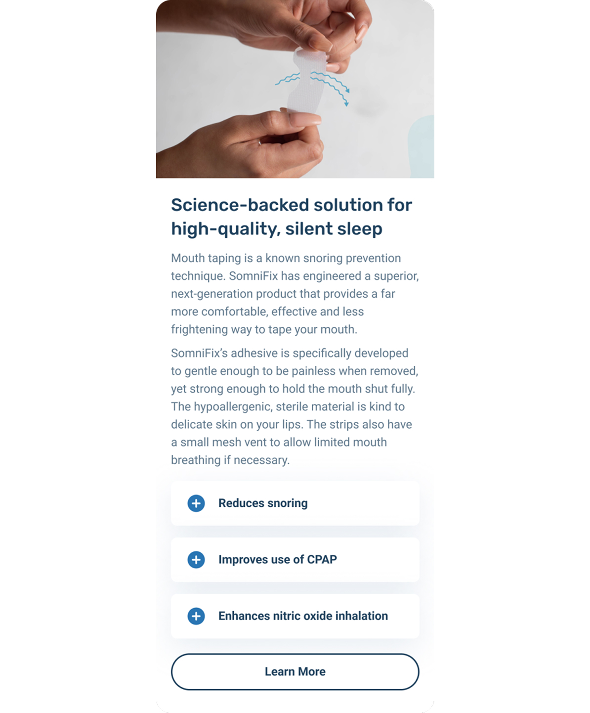
We expect to increase credibility via an accordion menu section entitled ‘Science-backed Solutions for High-quality, Silent Sleep”, where users can find information on how SomniFix aids CPAP, reduces Snoring, and enhances Nitric Oxide Uptake.
Section with scientific evidence
Visual Hierarchy & Visual Adjustments:
We expect to make it easier for users to scan and consume information on the homepage by increasing the amount of formatting with more subheads, lists, quotes/testimonial boxes, bolded text, etc.
We expect to increase user comprehension of the product’s functions, features and benefits, by adding more visual elements to the page. These include a diagram of the product’s features, visuals for each subhead in the problem block, and a step-by-step ‘how to use’ visual walkthrough. These visual elements are arranged to match the user’s natural investigation process, and will increase the rate at which the homepage communicates information.
Control
Alternative
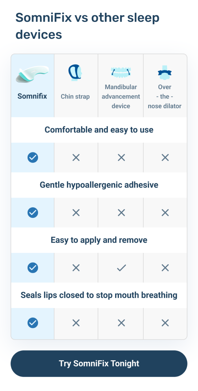
We expect to position SomniFix as the only solution for mouth breathing issues by creating an infographic chart that showcases the features of SomniFix as compared to other anti-mouth breathing devices (such as chin straps, mandibular devices, and over the nose dilators.)
Comparison table
Interactive Elements:
We expect to increase the rate at which users interact with the page by adding more buttons to click – split between buttons to progress to the transaction stage, and buttons that will allow users to expand accordion menus to view more information. These accordion menu sections keep the page scrollable, while also giving users the option for a deeper and more problem-specific customer journey, if they so wish.
We expect to increase the rate at which users progress to the next stage by introducing a sticky CTA button that will track with the user as they scroll. By keeping a CTA visible at all times we will be able to make the transition to the next stage as seamless as possible.
Results
The results are split between two iterations. The difference between the two iterations is where CTAs progressed users to.
In the first iteration, it progressed users to a Slide-In PDP for transactions. Whereas for the second iteration, it progressed users to an entirely new PDP page for transactions.
Results for the first iteration were negative:
-
Mobile conversion rate reduced by -12.32% and ARPU dropped by -14.55%
Results for
the second iteration were a lot more positive:
-
Mobile: There is a statistically significant increase in CR to purchase +22.67% (confidence 96%, power 80%) and in ARPU +32.21% (confidence 90%)
This is because the slide-in PDP only option created a journey where users were not being exposed to all of the information on the product detail page. This left them uninformed, and incapable of making a decision.