Key Takeaway
By triggering a targeted exit-intent pop-up that displayed cart contents and communicated product scarcity, we increased Eldorado.ua’s conversion rate by 7% and average revenue per user by 4%. This real-time intervention reduced cart abandonment by encouraging users to complete purchases within the same session.
Client Overview
Eldorado.ua is one of the largest online electronics retailers in Eastern Europe, with over 2 million unique visitors per month (according to Similarweb). The platform offers a wide range of consumer electronics, home appliances and tech accessories, supported by a solid e-commerce infrastructure and extensive product inventory.

Opportunity Background
Funnel analysis identified a significant drop-off between the "add to cart" and "purchase" steps, especially on desktop devices. Further behavioral research showed that many users added items to their cart, then left the website (often to check prices on competitor websites). In many cases, users never returned, even if they didn't find a better deal elsewhere.
We also discovered that many high-demand products on Eldorado.ua were in limited supply, but this information wasn't clearly presented to users during the purchase process. We saw an opportunity to reduce abandonment by highlighting product scarcity at the right point in the user journey.
Solution
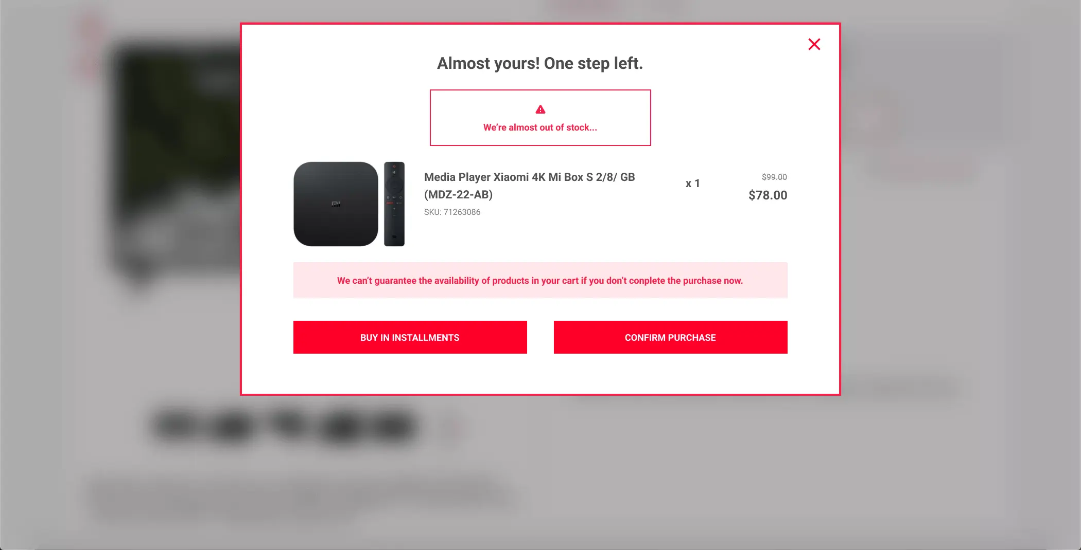
To address this problem, we introduced an exit-intent pop-up that was triggered when a user moved their cursor to the top of the browser, an indicator of intent to leave the site. The pop-up displayed the exact products in the user's cart, along with a scarcity message emphasising that the items may not be available for long.

This message was only shown to users who had added at least one item to their cart during the current session. The design focused on urgency without overwhelming the user, with product images, short copy, and a clear "confirm purchase" call to action. The aim was to re-engage users at the moment of hesitation, providing both a visual reminder of their cart and a contextual prompt to complete the transaction now rather than later.
Results
The optimised experience resulted in a 7% increase in conversion rate and a 4% increase in average revenue per user. Users who saw the exit-intent pop-up converted at significantly higher rates, confirming the effectiveness of scarcity messaging in reducing cart abandonment.