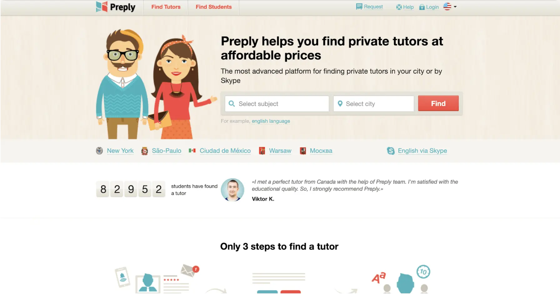
We removed unnecessary elements competing for users’ attention on the homepage in order to focus their attention on making the first step in the conversion flow: selecting a subject to study and city of residence. This move led to a 17.2% uplift in the CR of reaching the search result page, and a 11.2% uplift in ARPU.
Our client Preply.com is a leading marketplace that helps students find private tutors to study online. The service is focused predominantly on helping students find tutors for studying languages.
Preply’s monetization strategy is based on charging a commission fee for every hour of study with a tutor.
Our goal was to increase revenue from new visitors by optimizing the flow of searching for a tutor. This meant optimizing the engagement with the tutor search tool and improving the transition rate from the homepage, where users most commonly enter the site, to the search result page.
Our initial analysis showed that the homepage, which is the most popular point of entry to the site, generated a significant proportion of drop-offs. Given that the homepage was the first stage of the strict funnel that required a visitor to input requirements to search for a tutor, we decided to concentrate our CRO efforts here.
So we broke down our primary goal of generating an uplift in ARPU into steps, and decided to first concentrate on optimizing the UX of the first seconds after a user lands on the homepage.
You are probably aware of the fact that the average attention span of homo sapiens on a website is shrinking every year (from 12 seconds in 2008 to 8.2 seconds in 2015). So the importance of optimizing user experience in the first seconds of interacting with a site cannot be underestimated.
We conducted user tests and identified that users are significantly distracted in the first seconds of their UX on the homepage. There are numerous elements on the first screen of the homepage that are effectively competing for users’ attention.
The majority of the elements that we identified as distractions are related to social proof. Normally, social proof is considered to have a positive effect on the conversion rate. However, we hypothesized that its effect in this case was the opposite, as the site asked for a low commitment conversion using hard sell tactics.
Moreover, we found that users were encouraged to scroll below the first screen while the tutor search tool is located on the first screen on the most popular screen resolutions on desktop.
This scroll motivation technique is widely used in SaaS and complex B2B products where it is imperative that a user consumes sufficient content to convert. However, with a service marketplace like Preply, the value of the site is better comprehended by proceeding down the funnel and generating a search result, where users can see a wide selection of tutors and opportunities to work with them.
In video session recordings, we saw that some considerable proportion of users who scrolled below the first screen never returned to the top of the homepage to interact with the search tool. Given that the site motivated users to scroll below the first screen, that was an obvious conversion killer.
Moreover, we created a regression model and found that scrolling and clicking on elements below the fold negatively correlated with the conversion rate.
We hypothesized that a strong unique value proposition is sufficient to entice visitors to use the tutor search tool, and progress to the next step of the conversion funnel.
We further theorized that removing all the distractions from the first screen of the homepage that are not critical to convincing users to engage with the search tool would drive user engagement with the search tool, and increase the microconversion rate from the first stage of the funnel (homepage pageview) to the second stage of the funnel (search result pageview). Our hypothesis implied that improving microconversion at this critical stage of the funnel would lead to an uplift in macroconversion to sale, and as a result an uplift in ARPU.
To validate the hypothesis, we conducted an experiment where we compared the control variation with the alternative variation.
The experiment had the following characteristics:
Experiment type: A/B test
Traffic split: 50/50
Device: desktop
Key metric: ARPU
Secondary metrics: 1. User engagement rate with the tutor search tool, 2. Microconversion rate from the homepage to search result page.
Number of users that participated in the experiment: 133,252
The alternative variation outperformed the control variation by generating a 17.2% uplift in microconversion from the homepage to the search result page, and an 11.2% uplift in ARPU.
The result of the experiment achieved 95% statistical significance.
Schedule a FREE consultation to get: