Increased the average number of PDP page views per session, resulting in a 6% increase in a marketplace’s average revenue per user (ARPU).
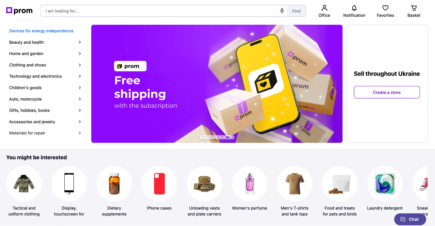
Our client Prom.ua is one of the largest marketplaces in Eastern Europe with 60 million sessions per month (according to Similarweb). Prom.ua enables its merchants to sell a wide range of B2C and B2B products.
Prom’s monetization strategy is partly based on visits to PDPs: every time a user visits a particular PDP, the merchant who owns that PDP is charged for that visit.
Our goal was to increase Prom.ua’s ARPU by increasing the average number of PDP page views per session.
Prom’s site is one of the best optimized eCommerce sites in Eastern Europe and required a deep analysis of its revenue structure and user behavior to accomplish this task.
Our research began by identifying revenue drivers and user behaviors that correlate with higher ARPU.
As identified, the key revenue driver is the average number of PDP page views per session.
The user behavior that feeds the revenue driver is a click on a product icon in the product listings that results in a PDP pageview.
We then decided to identify and evaluate all product listings on the site that generated PDP pageviews. We found that the majority of PDP visits came from product listings on category pages. However, we also found that a proportion of PDP visits came from clicking on a block of recommended products on PDPs.
In addition, our funnel analysis showed that users were most likely to end a session on PDPs, which is natural behavior when a user hasn’t found what they’re looking for. So we decided to focus on ways to increase the average number of PDP visits by providing a natural flow from one PDP to the next as an alternative to leaving the site.
We sought to identify the factors that define a user’s motivation to engage with the block of recommended products on a PDP. We found that 75% of users never see this block because it is located deep in the fifth screen of the page, where only 25% of users scroll.
We decided to move this block to a more prominent position to increase its visibility, but we struggled to find a place for it in the top two screens because all of the elements there are critical to conversion. However, we found a way to place the recommended products block on the second screen. This required moving the buy button to a sticky block at the top of the screen.
Increasing the visibility of the Recommended Products block on PDPs by moving it to a more prominent position on PDPs will increase the engagement rate with this block and, as a result, increase the average number of PDP page views.
To validate our hypothesis, we conducted an experiment in which we compared the control variation with the recommendation block on the fifth screen of a PDP with our alternative variation in which we moved the recommended products block to a more visible position on the page.
The experiment had the following characteristics:
Type of experiment: A/B test
Traffic split: 50/50
Device: Desktop
Key metric: ARPU
Secondary metrics: User engagement with recommended product block
Number of sessions that participated in the experiment 4.5 million
Number of conversions recorded in the experiment: Approximately 300,000 conversions per variant
Schedule a FREE consultation to get: