Boost e-commerce sales with personalized content blocks tailored to customer intent

Maximize ARPU & CVR with personalized landing pages using customized content blocks to navigate user intent


Reading time: 8 min

Boost e-commerce sales with personalized content blocks tailored to customer intent

Pay only for actual funnel conversion rates growth based on A/B test results


Schedule a consultation

Key Takeaway

Your unique selling point is how you stand out from the crowd and differentiate your
product as worth buying over someone else’s. However, it can be a double edge sword.

The more unique or innovative your product, the harder it will be for
audiences
to intuitively connect their problems and needs to your unique solution.
Solving
this
lack of awareness will require you to invest more time and effort into explaining exactly how
your
product can perform in different use-cases.

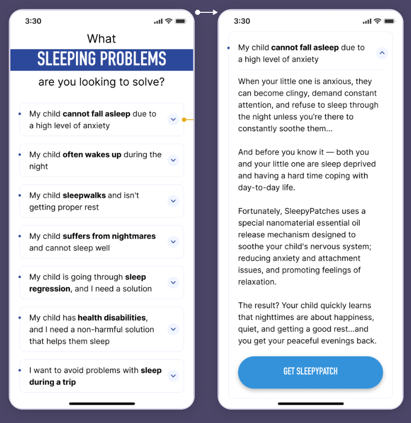
Using dropdown boxes to control user awareness & engagement — creating personalized
customer journeys that increase ARPU & CVR.

+22.68%

CVR

+28.35%

ARPU

Landing page content should be curated to address user problems, desires, and
objections
as quickly as possible. For many products, microcopy & accompanying graphics alone may be enough
to
deliver the full value proposition and supporting risk-reversals/social proof.

For other products, especially those that may seem unique or innovative to
audiences,
microcopy may not be enough. Instead, blocks with extensive explanations may be needed so that
users
can effectively match their intent & needs to your product.

Without this additional information, many users may remain unclear about what your
product can help them achieve – and that lack of [awareness] can mean that your store will fail
to
meet its full potential in terms of sales & conversion rate.

This was the case for our client, NATPAT – who had been encountering
the
same issue across several of their stores.

Stages of Awareness:

The five stages of awareness, from unaware, problem aware, solution-aware,
product-aware, and most-aware
, outline how informed a prospect is of their own
needs,
and your product’s ability to meet that need.

A customer who is not sufficiently aware has no logical reason to buy.

Eugene Schwartz initially tackled this issue in his 1966 book, Breakthrough Advertising.

The client

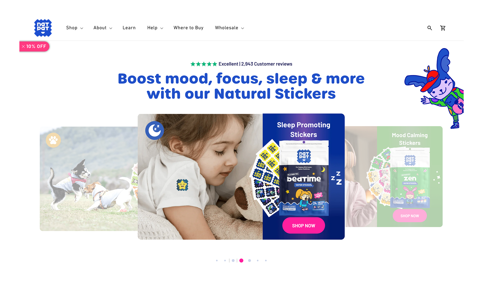
NATPAT allows customers to access the healing and remedial powers of natural
essential oils via specially engineered stickers. Each colorful and child-friendly sticker is
designed to help in everyday situations – from repelling mosquitoes, soothing bites, aiding
sleep,
relieving stress, and more.

Currently, they run three different stores:

  • image

    The SleepyPatch uses essential oils to help children relax at night

  • image

    The ZenPatch uses essential oils to help regulate mood for kids

  • image

    The Magic Patch mechanically lifts skin around a bug bite, draining away
    insect saliva so that bug bites may heal more quickly

Initial evaluation

What we liked about NATPAT is their unique and fun approach to using stickers
to
solve everyday problems. Using stickers as a medium for essential oils allowed them to create a
[unique selling point] that many other similar solutions (such as diffusers or sprays) lacked –
which is that their products are easily portable, mess-free, and also
child-friendly.

image

Because of this, the product range’s relatively low price point, and the performance
benchmarks for other similar products, we expected the Natural Patch’s product range to be
performing quite well. However, our initial evaluation revealed that users were simply
not
progressing from the Product Detail Page through to the CTA at the expected rate.

Ultimately, due to the uniqueness of their products, many of their visitors
were
simply not aware or informed enough to go through with a purchase.
If it was
clearer
why Natural Patch products are necessary, and why they’re such a good deal, then these users may
have converted. 

However, because the information they needed to make a connection between their
needs,
and the Natural Patch products wasn’t readily accessible, these visitors instead churned –
purely
out of confusion.

Our goal then was to rethink the information architecture of Natural Patch’s
Product Pages for the purposes of clarity, awareness, and engagement
, so that we
could
better match their product range to user intent and purchase drivers.

  • What did users need to know?
  • How could we deliver that information without using up too much space?
  • How should that information be ordered and organized?

Empathizing

Before we could begin answering the above questions, we first needed to
empathize with the user.

To discover how our users felt about their current journey with Natural Patch’s
three
different products, we conducted seis different user surveys.

For each store we conducted a survey using an on-site questionnaire
form.

For each store we also conducted an email survey.

Why two different types of surveys for each store?

It’s a litmus test for intent.

We expect buyers and non-buyers to give very different answers.
This is
simply because not everyone who lands on your website and fills out a questionnaire is actually
looking to solve their problems.

Because of this, when your survey results are wildly different, it’s likely
a
sign that a lot of your traffic has low intent
. Conversely, if the answers are very
similar, then it’s a strong indicator that you and your media buyers have managed to dial in on
a
near-perfect target audience (HOORAY!)

But first – test it:

Which we did, and ultimately, we ended up discarding non-buyer survey information.
As
expected, the output from their data just didn’t resonate as well with audiences. Because of
this,
it produced an insignificant effect on conversion rate.

As a result, the only truly useful information came from buyers,
and
empathizing with them became our main focus.

Using Buyer data we collected the following insights into their motivations
and
pain points:

  • image

    E-mail survey SleepyPatch

    What circumstances led you to look for a sleep promoting
    products
    like SleepyPatch?

    • 13%

      My child has a high level of anxiety and can’t fall asleep

    • 12%

      I’m afraid that my current sleep solution may hurt my child, so I need
      something
      safe

    • 9%

      I waste a lot of time putting my children to bed because they can’t unwind

    • 9%

      My child has health disabilities, and I’m trying to find a solution that
      helps to
      sleep well

    • 9%

      My children go to sleep late, and as a result, I don’t have enough time to
      sleep

    • 7%

      I need qualitative rest and can’t receive it because my children often wake
      up
      during the night

    • 7%

      I want to overcome the stress that doesn’t allow me/ my child to sleep

    • 6%

      I don’t know how to switch off the brain of my children to get them asleep

    • 6%

      I’m worrying that bed sleep affects the health of my child

    • 4%

      My child doesn’t want to sleep in his bed. As a result, I don’t have enough
      rest

    • 4%

      My children wake up too early, and as a result, I don’t have enough time to
      sleep

    • 3%

      All other solutions are uncomfortable to use for my child

    • 3%

      I plan a trip and am afraid that it would cause sleeping problems for my
      child

    • 3%

      My child suffers from nightmares and can’t sleep well

    • 3%

      My children are going through sleep regression, and I try to improve it

  • image

    E-mail survey ZenPatch

    When did you realize you needed a calming product like
    ZenPatch?
    What circumstances led you to look for calming product?

    • 25%

      To calm down before/at bedtime

    • 14%

      Having ADHD

    • 14%

      Feelings of anxiety

    • 13%

      To help calm my child down at school

    • 9%

      Needing to regulate emotions

    • 8%

      Being on the autism spectrum

    • 8%

      Needing a natural solution

    • 6%

      Needing to control emotions in stressful situations

    • 5%

      Needed an alternative solution

    • 5%

      To calm down at work

    • 5%

      Child too hyperactive

    • 3%

      To calm down (without specification)

    • 3%

      To help while overwhelmed with emotions and excitement

    • 3%

      Needed and easy-to-use solution

    • 2%

      To help with mood swings

    In what situations do you usually use
    our
    stickers?

    • 46%

      Bedtime

    • 21%

      At school

    • 15%

      Stressful events

    • 10%

      When feeling anxious

    • 7%

      When having an emotional day

    • 5%

      At work

    • 3%

      Any situation when cannot calm down

    • 3%

      Daily/all situations

    • 3%

      Meltdown

    • 3%

      When getting worked up emotionally

    • 2%

      In the car

    • 2%

      During menstrual cycle

    • 2%

      When we need to travel

  • image

    E-mail survey MagicPatch

    When did you realize you needed a product like MagicPatch Itch
    relief patches? What was going on in your life that caused you to come looking
    for
    itch relief solution?

    • 27%

      I/my kid get(s) a lot of bites

    • 15%

      I/my kid react(s) badly to mosquitos bites

    • 12%

      I/my kid scratch(es) the bites

    • 10%

      Went to a location with a lot of mosquitos

    • 8%

      Needed a non—chemical solution

    • 8%

      I/my kid had an itchy reaction to bites

    • 5%

      Needed to switch from spray/cream/gel

    • 4%

      My kid wakes up at night complaining about itches

    • 3%

      I have BuzzPatches and decided to get itch relief patches/l bought them with
      BuzzPatches

    • 3%

      Wanted to get them for my kid/grandkid

    • 3%

      I/my kid spends a lot of time outside

    • 3%

      I/my kid suffers from large welts

    • 1%

      I sought a remedy that wouldn’t need constant reapplication

    • 1%

      My kid swells up when bitten

    • 1%

      I needed an easy to use solution

    • 1%

      Other

    In what situations do you usually use our stickers?

    • 43%

      Being outside: activities, working, traveling

    • 38%

      After getting a bite

    • 5%

      In the evening

    • 4%

      At night

    • 4%

      During summer time

    • 4%

      When bites are itchy, red

    • 3%

      At school

    • 2%

      When outside for extended amounts of time

    • 1%

      When it is scratching too much

    • 1%

      If a child is complaining about a bite

    • 1%

      If other solutions do not work

    • 1%

      When the bite lasts longer than a couple of days

    • 1%

      When a child gets bitten and wants to scratch

    • 1%

      Other

Insights

From our user surveys, it became clear that a variety of problems were motivating
users towards Natural Patch’s product range. However, the current landing page’s language and
structure was clearly failing to address many of these motivating issues. 

Because of this, visitors were receiving unfulfilling customer journeys –
where initial interest wasn’t being met with enough personalized or relevant content to make
a sale.

Fortunately, our User Survey gave us enough information to begin revamping the way
Natural Patch’s product pages presented information:

  1. We now know what language users would respond to.

    We could take the EXACT wording survey respondents used in their answers, and begin
    reflecting [Mirroring] it onto the updated Landing Page.

  2. We now know how to prioritize these problems.

    The quantitative aspects of our user research meant that we could rank problems from most
    common and most important – because many users identified with that particular problem,
    to least common and least important – because that particular problem collected the
    least amount of responses.

Mirroring

Mirroring is a popular sales/negotiation technique where you reflect
a person’s behavior, body language, and speech back at them so as to create an
immediate connection.

Christopher Voss, Former FBI hostage negotiator, goes into depth about how effective
mirroring can be in his NYT best-selling book, Never Split The Difference.

Hypothesis

Our research made our hypothesis simple: If we used the survey data we
collected to create highly personalized content blocks that directly resonated with and
addressed specific user problems, then we would be able to create customer journeys that are
more fulfilling, and more likely to lead to a sale
– thereby increasing
ARPU
and CVR.

What is a fulfilling customer journey?

It’s where you feel like you’re discovering the product that was 100% designed to solve
your unique problems.

  1. These content blocks would appear just below the hero section of the
    landing page.

    By positioning it higher on the page we would allow users to immediately begin
    self-segmenting themselves into their own unique journey – where they can choose to read
    more about problems that are relevant to them, and collect all of the information that
    they need to make an informed decision upfront/as early as
    possible.Additionally, we would organize these problems by order of frequency –
    problems that collected the most interest from respondents were at the top, least at
    the bottom.

  2. Dropdown boxes would be used to provide an experience that delivers
    depth of information while still keeping the page concise.

    Users can freely use the dropdown boxes to minimize/expand their customer
    journey, while still retaining the option to simply scroll quickly through the page and
    skip to key sections below (such as competitor comparisons and social proof/reviews.)

    This gives users the choice between skimming, or diving deeper into unique issues that
    they feel are relevant. Additionally, these dropdown boxes would automatically
    close whenever you select a new one – keeping the page and user experience as
    streamlined as possible.

  3. The dropdown boxes would be structured with the headline being the
    problem (the language of which was given to us by the users).

    Additionally, the explanation within would often follow a clear problem –
    agitate – dream-state format.
    This allows us to take the user
    through a clear journey of what their problem is, how it will get worse if they
    don’t solve it soon, and then the dream-state they can achieve once Natural Patch
    has been used to solve their problem.
    This copywriting structure was chosen
    for its ability to amplify a reader’s pain & desire in the shortest reading time
    possible.

Results

One of the most fascinating aspects of this experiment is how following the
same
methodology – but informed by two different sets of data, created such drastically different
results.

The first iteration of this experiment was produced by data collected from
non-buyers. When tested, our results were statistically insignificant. 

Why? Simply because the information that we collected from non-buyers, when turned
into
headlines and problem-call outs, did not resonate with users, either due to not being a
significant
enough issue, or because the call-out just didn’t feel specific or relevant enough.

Below you can see the first iteration, and the second iteration, which was created
using the
exact same UI and copywriting approach, but simply adjusted to buyer only
information:

image

Iteration 1:

  • Only 11.3% of users interacted with the block, as opposed to
    23.59% in the second iteration.

  • Positive results were statistically insignificant, but there was
    a positive trend, so we decided to proceed to a second
    iteration of the experiment.

  • CVR +2.2%, ARPU +8%, AOV +5.7%

image


image

Iteration 2:

  • 23.59% of users interacted with the new Problem Block

  • Conversion Rate increased by 22.68%

  • Revenue Per User increased by 28.35%

  • AOV increased by 4.68%

We then took the methodology used in the second iteration, (buyer only information)
and applied it to Natural Patch’s other stores. The results were as follows:

image

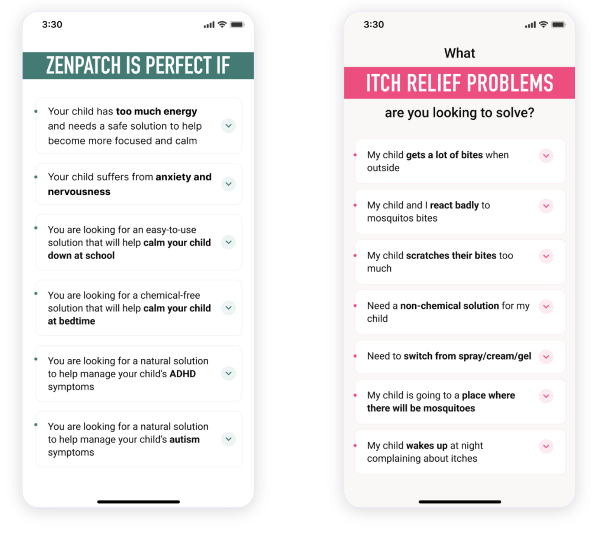
Zen Patch:

  • 7.98% of users interacted with the new block

  • Conversion Rate Increased by 10.41%

  • Revenue Per User Increased by 13.64%

  • AOV increased by 2.94%

image

Magic Patch:

  • 23.59% of users interacted with the new block

  • Conversion Rate increased by 6.8%

  • Revenue Per User increased by 15.2%

  • AOV increased by 7.2%

Further considerations:

When you have a target audience with a range of specific problems and low awareness on how
your product can be the solution to these problems, your total CVR can easily be
increased by creating content blocks that directly call out and address each unique
pain-point.
The key, however, is that it’s important to tailor these content blocks
towards the information provided by buyers, as buyer data will provide you with the
highest relevance & intent.

Pay only for actual funnel conversion rates growth based on A/B test results


Schedule a consultation

Also want such results as NATPAT

Schedule a call with our analyst.
He will learn about your business and provide you with actionable recommendations

Get 3 CRO hypotheses for FREE

Pay only for actual funnel conversion rates growth based on A/B test results

Schedule a consultation
microsoft combinator
Schedule a consultationGet 3 Free CRO
recommendations for your funnel
Conversion Rate Store
Get a sample of CRO audit that will be relevant to your website


    Conversion Rate Store
    We will set up a 15 min call and give you the price of CRO retainer on the call


      Conversion Rate Store
      We will set up a 15 min call and give the price of CRO audit on the call


        Conversion Rate Store
        • Get 3 Free CRO recommendations for your site
        • Calculate CRO project ROI
        • Enquire about CRO project cost


          Conversion Rate Store

          Schedule a FREE consultation to get:

          • Actionable plan on how to increase needed metric
          • Industry-relevant case studies
          • Benchmarks of similar funnels to compare with competitors


            Conversion Rate Store
            Our leading CRO strategist will review your website, ask metrics on the call and give you 3 actionable recommendations on how to increase conversion rates for free.


              Conversion Rate Store
              • Get 3 Free CRO recommendations for your site
              • Calculate CRO project ROI
              • Enquire about CRO project cost


                Conversion Rate Store
                • Get 3 Free CRO recommendations for your site
                • Calculate CRO project ROI
                • Enquire about CRO project cost


                  Conversion Rate Store

                  Schedule a FREE consultation to get:

                  • Actionable plan on how to increase needed metric
                  • Industry-relevant case studies
                  • Benchmarks of similar funnels to compare with competitors


                    Conversion Rate Store

                    Schedule a FREE consultation to get:

                    • Actionable plan on how to increase needed metric
                    • Industry-relevant case studies1
                    • Benchmarks of similar funnels to compare with competitors


                      Conversion Rate Store
                      Send your CV

                        Your name

                        Your Surname

                        Descriptions

                        Your request has been received. We will contact you shortly.

                        Go to career page